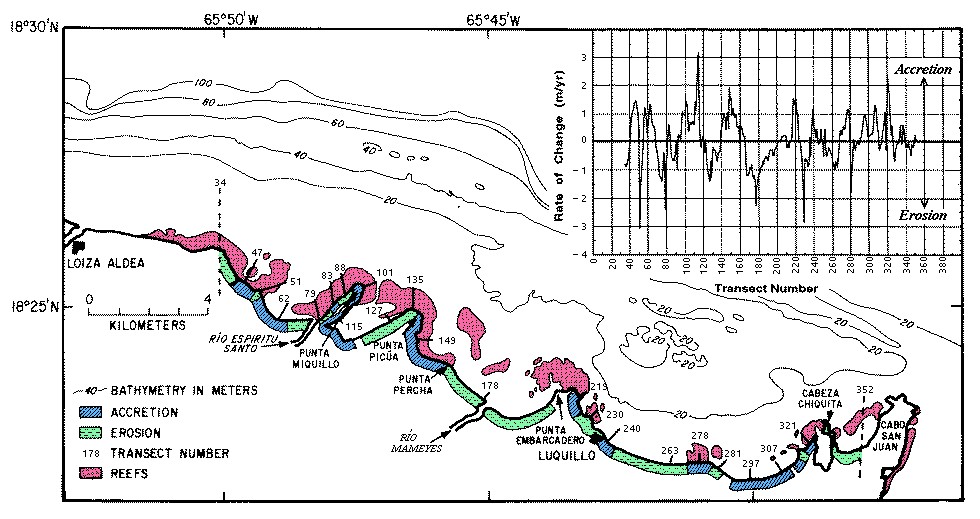
Figure 3. - Chart (inset) showing the average yearly rate of shoreline change in the study area during the period 1936-1987 (positive values on y-axis represent accretion; negative values represent erosion) and a map showing the location of areas of erosion or accretion (data from Thieler, 1993). Data presented between transects 34 and 352. Representative transect numbers shown on the location map correlate with those on the chart.
[an error occurred while processing this directive]