
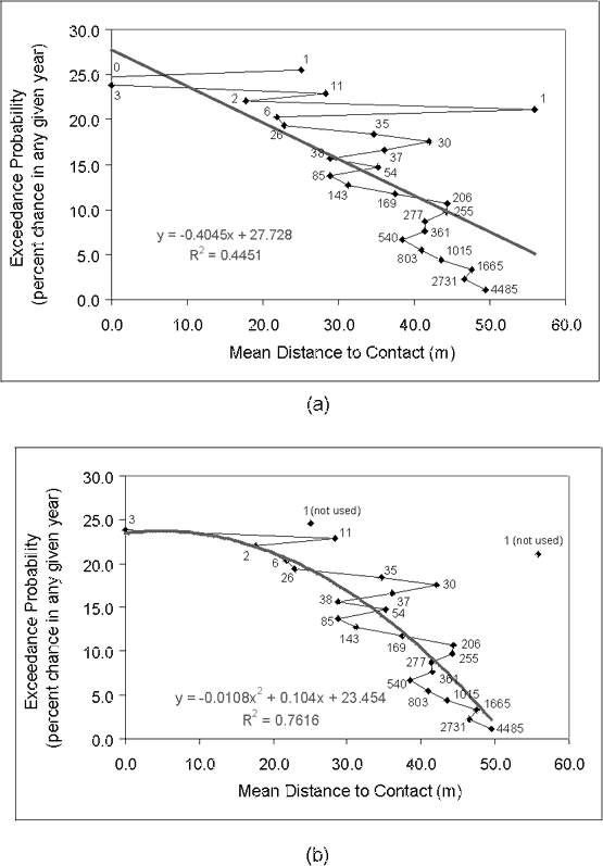
Figure 9. Scatter diagrams showing annual exceedance probability and mean slope. Mean slopes calculated for each set of grid cells having annual exceedance probabilities as shown in table 1 (for example, 1.1, 2.2, 3.3...). Numbers refer to the number of grid cells used to calculate the mean slope for each exceedance probability value. (a) Diagram showing best fit line and equation computed using a least squares fit and all data points. (b) Diagram showing best fit line and equation computed using a least squares fit and data points where the number used to calculate mean slope is greater than 1.
| AccessibilityFOIAPrivacyPolicies and Notices | |
| |
|