Deaggregation of U.S. Seismic Hazard Sources: The 2002 Update |
By S.C. Harmsen, A. D. Frankel, and M. D. Petersen |
U.S. This report is preliminary and has not been reviewed for conformity with U.S. Geological Survey editorial standards or with the North American Stratigraphic Code. Any use of trade, firm, or product names is for descriptive purposes and does not imply endorsement by the U. S. Government. |
| U.S. Geological Survey Open-File Report 03-440 |
Essential Background Material |
| Documentation for the 2002 Update of the National Seismic Hazard Maps (OFR 02-420) (A. Frankel and others, 2002) discusses the new models of seismic hazard, including newly recognized sources, as well as new treatments of previously recognized sources. The reader should be familiar with that document, available on the web at http://pubs.usgs.gov/of/2002/ofr-02-420, in order to better understand the components of the PSHA model that affect mean and modal source parameters. The OFR also discusses the way modifications came to be made from the previous USGS PSHA (Frankel et al, 1996), mostly through a series of regional workshops and follow-up meetings, where experts provided current models of seismic hazards for their regions and current models of strong-motion attenuation. Other changes to the PSHA model made after publication of OFR 02-420, such as the extension of the maximum distance (R) for calculating hazard for California A-faults from 200 km to 250 km, are also included in the calculations of this report. This report's calculations include all modifications through October 2003 (version 6 of the PSHA model). |
| On national and broad regional map scales, deaggregation analysis can help to highlight changes from the previous PSHA maps, but site-specific hazard deaggregation is necessary to gain a better understanding of newly recognized sources and revised treatments of previously recognized sources. The USGS WWW URL, http://eqint.cr.usgs.gov/eq/html/deaggint2002.html allows the visitor to deaggregate the seismic hazard at any location in the conterminous USA using the 2002 PSHA model, for a wide variety of spectral periods and return times. That web site exhibits contributions from all sources at a specific site, along with the mean and modal source information provided in this report. |
WUS Seismic Hazard Deaggregation Maps: The Mode |
| Maps of the modal-event magnitude, or |
| Modal-source distance, or |
| Modal-source e0, or |
| Modal magnitude maps are again shown for the 2% in 50 year PE for the
WUS in Figure
4. The left-side map shows data for the 2-s spectral period
and the right side for 0.1-s. Two s and 0.1 s are the longest and shortest
SA periods, respectively, calculated by the USGS national seismic hazard
mapping project (excluding PGA). A comparison of Figure
4 and Figure
1 indicates that a slightly greater region encompassing California's
Great Valley has a modal San Andreas source for the 2-s compared to the
1-s SA. In the east part of the WUS, an M7.7 New Madrid source everywhere
dominates the 2-s hazard out to the maximum source-to-site distance of
1000 km, but in only a few places for the 1-s hazard. For the 0.1-s SA
mode compared to the 0.2-s SA mode, the modal event magnitude tends to
be lower for the shorter-period motion, and frequently |
| The PGA modal-event M is shown for the WUS in Figure 5, the left side for the 2% in 50 year PE, and the right side for the 10% in 50 year PE. The PGA modal-event R for the WUS is shown in Figure 6. By showing two return-period modal-event maps together, we can see the effect of increasing or decreasing the probabilistic motion (which rises with mean return time) on the mode. Long recurrence-time faults, common in Nevada and parts of Arizona, New Mexico, Utah, and Colorado, are frequently modal sources at the 2% in 50 year PE, but cease to be as significant for the 10% in 50 year PE. Note also that Cascadia subduction M9 sources tend to extend their modal influence further east for the 10% in 50 year PE, because Cascadia subduction has an estimated recurrence time that is relatively short compared to that of many of the local sources of eastern Washington, Idaho, and elsewhere, which often dominate the 2% in 50 year PE modal-event maps, at least at short spectral periods. In general, decreasing the PE tends to increase the influence of local sources compared to more regional sources (Harmsen et al, 1999) in terms of contributions to the probabilistic motion. As long as the mean source recurrence time is relatively short compared to the return period under consideration, that source will tend to be important in the PSHA, often modal if close to the site, .large in magnitude, or both. |
| Figures 5 and 6 indicate that in many parts of the WUS, there is little change in the modal-source description associated with PGA for the 475-year and 2475-year return times. However, there are many sites at which closer smaller sources may contribute comparably to a given probabilistic motion as more distant larger sources for a given PE. At such sites, going from this PE to another in a deaggregation analysis will often result in a shift in the mode. Decisions about appropriate scenario earthquakes at these sites contend with multi-modal seismic hazard distributions for a given frequency of motion. One purpose of the interactive deaggregation web site is to assist in the determination if any given U.S. site has such a distribution of probabilistic sources. |
WUS Seismic Hazard Deaggregation Maps: The Mean |
| The mean M or |
| Like the modal M, the mean M for 1-s SA is often significantly greater than that for 0.2-s SA for a given PE. This is true for much of the WUS, as indicated in Figure 7. This can be partly understood by comparing median motion for 1s with median motion for PGA and a given PE. In this case m(M7+, 1s) > m (M7+,PGA) but m (M6.5-,PGA)> m (M6.5-,1s), where m is the median predicted motion for a given attenuation model and a given source recorded at a given site. These inequalities are meant to indicate that the ratio of median motion for longer period SA to shorter period SA progressively rises with magnitude, where other conditions are fixed. Thus, at a given level of probabilistic ground motion, larger sources are more important contributors at longer periods. |
| A comparison of Figure 7 with Figure 1 suggests that Cascadia subduction sources, although modal, represent only a small fraction of the seismic hazard in much of Washington and Oregon. In other words, Cascadia subduction earthquakes often have a low MCF in much of the Pacific Northwest. The fact that the mean M is 7 for 1-s SA in much of eastern Washington, while the modal M is 9 indicates that relatively low-magnitude local sources (M5 to 6) are quite important contributors to the 1-s SA hazard. This is not surprising, because those lower-magnitude sources can be modal for the 0.2-s SA in eastern Washington. Similar kinds of inferences can be made at many other locations of the WUS by comparing Figure 7 with Figure 1. |
| Approximate locations of fault lines often may be inferred better from |
| Mean R or |
| Mean e0 or |
California-Nevada Region Maps of Modal Source Parameters |
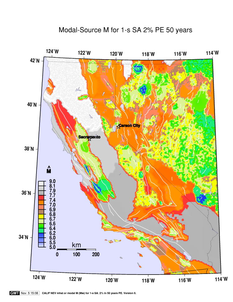
| Figure 10 shows the modal-source magnitude for the 1-s SA with 2% PE in 50 years for the states of California and Nevada. Modal-source magnitudes in this region range from about M6 mostly near Lake Mead to M9 in northern California. The white color in Figure 10 indicates where an M9 subduction event dominates the hazard, and shades of gray indicate where a large-magnitude San Andreas fault (SAF) source dominates the hazard. Seismic-wave attenuation models extend the modal influence of the megathrust source more than two degrees southeast of the Mendocino escarpment, the southern edge of the subducting oceanic plate. Similarly, an M8 source on the SAF contributes enough to seismic hazard at many sites in the Great Valley, almost 200 km east of fault trace, to be modal. The 2% in 50 year probabilisitic ground motions are relatively low in most of the Great Valley compared to other parts of western California. This implies that more local sources have low probability of occurrence compared to SAF main shocks. There is a paucity of recorded strong motion data at larger magnitudes and distances that might aid in validating large-M and large-R attenuation model predictions empirically. |
| In central California on a section of the SAF southeast of Monterey Bay, Figure 10 indicates that a M6.5 � source on the fault dominates the multi-segment rupture, higher magnitude, SAF scenarios. Relatively low-magnitude yet modal SAF events rupture either the creeping section or the Parkfield segment frequently. Compared to the multi-segment SAF sources, these single-segment ruptures have high recurrence rates or recurrence times on the order of a few dozen years, locally allowing the low-M to dominate the high-M SAF source. |
| Figure
11 shows the modal-source distance, or |
| Figure 12 shows the modal-source e0 for the 1-s SA with 2% PE in 50 years for the states of California and Nevada. The generally blue color of California's 2% in 50 year modal event e0 map (Figure 12) means that the 2%/50year 1-s SA is about 1.8 times the median from the modal source, often called a "deterministic" motion. If the modal source occurs in Nevada, the yellow to orange to red colors of the map (Figure 12) indicate that the probabilistic 1-s SA is lower than the median ("deterministic") motion. In western California, the best example of a Quaternary fault that has low probabilistic SA associated with it is the long-recurrence-time Rinconada fault within the Salinian block southeast of Monterey Bay. The 2% in 50 year 1-s SA is considerably lower than the median for a characteristic earthquake on that fault. The rate of random seismicity determined from seismic network monitoring is low in the vicinity of the Rinconada fault (Hill et al, 1991), resulting in uniquely low, for western California, 1-s e0 for sites near that fault. |
| Figures 13, 14,
and 15 show
the modal-source |
| For California and Nevada, the modal source contribution factor or MCF is plotted in Figure 16. The 1-s SA MCF is shown in the lower left map of Figure 16, the 0.2-s SA MCF is shown in the upper left map, and PGA MCF is shown in the upper right map, all for the 2% PE in 50 years. Also, the 1-s SA MCF for the 10% PE in 50 years is shown in the lower right map of Figure 16. The MCF achieves local maxima at sites near several faults of western California, sometimes exceeding 0.7 (70% or more of the hazard). For any spectral period, the MCF decreases with PE. In Figure 16, this is more evident in Nevada than in California. The MCF for 1-s SA and 10% in 50 year PE is generally less than 0.05 (< 5% of the hazard) for most sites in Nevada. The answer to the question, "how significant is the modal event?" at least with respect to the probabilistic definition, is that it is highly dependent on site location and on PE or exposure time. One can of course increase bin sizes to increase the MCF of the modal event. It is better, however, to recognize that a small MCF often indicates a multi-modal seismic-source distribution, and further investigation of non-modal sources might be worthwhile for many applications. |
Oregon-Washington Region Maps of Modal Source Parameters |
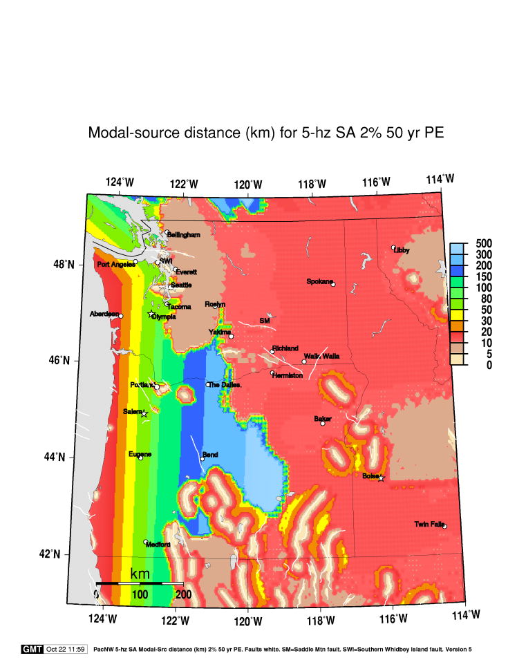
| Various geophysical investigations in Washington and Oregon have yielded information on urban-area faults and models of Cascadia subduction that alter the USGS PSHA model significantly from that of 1996. Many of these reports are referenced in Frankel et al.,2002. Modal-event parameters assist in evaluating the relative importance of these sources to Pacific Northwest seismic hazard. Figure 17 shows the modal M for the 2% in 50 year PE 1-s SA for Washington, Oregon, and parts of Idaho. Fault traces are gray or white in this and subsequent maps. For 1-s SA, M9 megathrust is the dominant source through most of the Pacific NW, except for sites near the few characterized faults, principally, the Seattle and S. Whidbey Island faults in the Puget Sound area, and various faults in southern and eastern Oregon. Note that many of the Quaternary faults of western Oregon and eastern Washington do not provide modal events to the 1-s SA hazard at the 2% in 50 year PE, because of their very low recurrence rates compared to those of Cascadia sources. |
| Figure
18 shows the 1-s modal distance ( |
| Figure 19 shows the 1-s modal-event e0 for the region. In western Washington and Oregon the 2% in 50 year motion generally exceeds median motion for the modal source. In eastern Washington and Oregon, the probabilistic motion can be more than double the median motion from a Cascadia megathrust source. Characteristic earthquakes on some of the Quaternary faults of southeastern Washington and Oregon, or on the Seattle fault, for sites sufficiently near those faults, yield 2% in 50 year motions that can be below the median motion from those sources. |
| Figure
20 shows |
| Local random sources dominate the 5-hz SA hazard at Bellingham, Washington, a change from the 1996 maps, where Cascadia subduction earthquakes were modeled closer to Bellingham, and dominated the hazard. The nearness to Bellingham of the boundary between local and M9 Cascadia sources implies that 5-hz SA (and PGA) has a multi-modal seismic hazard distribution at Bellingham, at least when data are binned as above. In fact the distribution of seismic sources is trimodal in Bellingham, with a third prominent peak associated with deep intraplate seismicity along with local and subduction sources, for higher-frequency SA. Deep intraplate sources like the destructive earthquakes of April 1949, April 1965, and the Nisqually earthquake of February 2001 play a prominent role in PSHA at most sites in the vicinity of Puget Sound. |
A Closer Look at Seismic Hazard in Portland, Oregon |
| Figure 21 examines the deaggregated seismic hazard source parameters for a site in Portland Oregon. Figure 21 is composed of four graphs. The bottom left graph of Figure 21 is a hazard curve for 1-s SA, where SA ranges from less than 0.05 g to about 0.8 g. The vertical axis is mean rate of SA exceedances per year, according to the 2002 USGS PSHA model. The solid-line graph is the hazard curve, i.e., the curve resulting from all considered sources. The dash-line graph is the hazard contribution from the modal or most-likely source. In general, and in Portland, these curves are far apart at low SA levels, but converge for high SA levels. The upper left graph of Figure 21 is the graph of mean (solid-line) and modal (dash-line) distance as a function of 1-s SA at Portland. Note that mean distance is a smooth curve that decreases monotonically, while modal distance is a step function. At this site, with coordinates 45.5 o N, 122.65 o W., the modal source distance is initially about 140 km for low SA, and changes significantly twice. The upper right graph of Figure 21 is mean and modal M for the site, 1-s SA. For low SA, the modal M is 8.3, then jumps to 9.0, then decreases to about 6.7. The first two modal M values correspond to Cascadia subduction, either a partial rupture, or a nearly entire oceanic plate megathrust, from the Mendocino escarpment to Vancouver Island. The final modal M corresponds to rupture on the Portland Hills fault system. The squares on the graphs are located at the 2% in 50 year ground motion, i.e., where the mean rate of exceedance is 0.000404. The modal M at this PE corresponds to a characteristic source on the Portland Hills fault. |
| The lower right graph of Figure
21 is mean and modal e0 for 1-s SA at Portland. Note
that mean e0 increases
monotonically with SA, but modal e0 has
a sawtooth pattern, dropping sharply at each SA-value where the modal
source (R,M) changes significantly, then ramping up (� linearly
with log SA). For the 2% in 50 year 1-s SA, the e0 corresponding to the Portland Hills modal source is about
-0.5. Note that e0 for
Cascadia sources in Portland is much higher, � 1
for the M9 source, at that PE. The sawtooth behavior of |
| With respect to the relationship between SA0 and |
Maps of Modal Source Parameters in the Intermountain Seismic Belt |
| The rapidly growing Salt Lake City-Ogden urban corridor is near the Wasatch front fault system, which has long been known to be a substantial earthquake threat. Return times for characteristic earthquakes on these faults is 1500 to 2000 years. Some of the largest conterminous U.S. earthquakes in the latter half of the twentieth century occurred in the ISB region, although not on the Wasatch front. These include Hebgen Lake, an M7.3 earthquake that occurred in 1959, and Borah Peak, an M6.9 earthquake that occurred in 1983. |
| Figure 22 shows the 1-s SA for the 2% in 50 year PE for the ISB region. The left side shows the update-map SA level, in percent g. The 1-s SA can be in excess of 60% g for sites near the Wasatch frontal fault system and near faults in western Wyoming. The right side shows the change in SA, i.e., the 1-s SA of the 2002 map minus that of the 1996 map, in the same units. This map shows that there has generally been less than 10% g increase or decrease in 1-s SA from 1996 to 2002. One of the largest changes occurs for sites near the Joes Valley fault system, designated JV in Figure 22. For sites near JV, the increase in 1-s SA can exceed 25% g. The east-dipping JV fault has a relatively high slip rate, 0.75 mm/year, which has increased significantly from that used in the 1996 PSHA. |
| The broad regional increase on the order of 5 to 10% g in the 1-s SA for 2002 compared to 1996, evident in Figure 22, results primarily from newly included attenuation models. The 0.2-s SA in the ISB region (not shown) generally decreases compared to that of 1996, except near a few faults on which rate estimates have increased. The regional decrease in 0.2-s SA is due, again, to new attenuation models, most notably, Spudich et al (1999). Sufficiently large increases in random seismicity rate estimates (a-grid values) can increase the 0.2-s SA from that of 1996, more than offsetting the lowering effect of new attenuation models. Pocatello, Idaho, is one city where local a-grid increases result in about a 5 to 10% g increase in 0.2-s SA. Changes in a-grid values have little influence on the 1-s motion, however, at least at the 2% in 50 year PE. |
| Figure
23 shows the 1-s modal-source magnitude, or |
Central and Eastern U.S. Modal Source Parameter Maps |
| Figure
24 shows 1-s and 0.2-s SA modal-source magnitude,
or |
| The other major seismic hazard source in the CEUS is a mainshock in the Coastal Plain of South Carolina, similar to the 1886 earthquake. The modal-source M is 7.3, as it was in 1996, although in 2002, there is a distribution on possible magnitudes from 6.8 to 7.5. M7 sources on the Meers fault of southwest Oklahoma are modal through much of Oklahoma and Texas, especially for the 0.2-s SA. The Meers fault, shown as a faint white line, is the only Quaternary fault with known location in the region mapped in Figure 24 that is recognized as a fault source in the 2002 update (same as in 1996). A few other possible CEUS tectonic Quaternary faults are discussed in Crone and Wheeler (2000). |
| According to the hazard depicted in Figure
24, several pockets of local seismicity with mean M < 5
dominate the 0.2-s hazard from eastern Tennessee north to Ohio and
northeast to Maine, although none of these low-M sources dominates
the 1-s hazard anywhere in the CEUS. Another prominent source zone
on both 1-s and 0.2-s |
| Figure
25 shows 1-s and 0.2-s SA modal-source distance, or |
| Many of the red spots in the 0.2-s CEUS |
| The left and right sides of Figure 26 show the modal-source e0 for the CEUS for 1-s and 0.2-s SA with 2% in 50 year PE. The 1-s map shows that for much of the CEUS the 2% in 50 year probabilistic motion is about 1.8 times the median motion from the modal or most likely source. However, at some CEUS sites the 2%/50 year motion is somewhat less than the median ground motion from the modal source. Such site locations are indicated with yellow, orange, red, and brown colors in Figure 26. The 0.2-s map also shows large regions for which the 2% in 50 year motion is greater than the modal-source median motion. Sites in the western Long Island/eastern New Jersey region, for example, have 5-hz probabilistic motion about 1.2 to 1.4 times the median motion from the modal source. Exceptional regions are found near possible locations of the Charleston, S.C., mainshock, and the Meers, Oklahoma, fault. At these locations the probabilistic motion can be significantly lower than the median of the characteristic earthquake. |
| Figure
27 is a map of |
| Figure
28 shows modal-source e0 ( |
Central and Eastern U.S. Mean Source Parameter Maps |
| Figure
29 shows the mean-source magnitude, |
| Figure
30 shows the mean source distance, or |
| Figure 31 shows CEUS-region maps of the mean-source e0, the left map for the 1-s and the right map for the 0.2-s spectral periods, for the 2% in 50 year PE. These maps show that over broad regions the 2% in 50 year motion is greater than median motion from the mathematically defined but otherwise nebulous "mean" source, even for sites near the NMSZ, shown as three white S-shaped curves. The only geographically extensive region of Figure 31 where 2% in 50 year motion does not approach the median motion from the mean source is in the vicinity of the Meers fault of southwest Oklahoma, shown as a white line in Figure 31. |
New Madrid Seismic Zone Modal Source Parameters |
| The NMSZ has the highest probabilistic ground motions in the CEUS. The 1811-1812 mainshocks have estimated M ranging from 7 to 8 and greater. In the 1996 PSHA maps, the NMSZ characteristic sources were modeled with M=8. In the 2002 maps, the characteristic source is modeled with a distribution of M from 7.3 to 8. The modal magnitude tends to be M7.7 for a wide range of spectral periods and return times for most sites in the vicinity of the NMSZ. In 1996, the estimated mean recurrence time of this source was 1000 years. In 2002 the estimated mean recurrence time is 500 years (Frankel et al., 2002), based on recent research findings of paleoseismologists. The simultaneous lowering of M and raising of recurrence rate produce offsetting effects on probabilistic motion for the 2% in 50 year PE. The higher rate does however increase the 10% in 50 year PE SA levels considerably from those of 1996. |
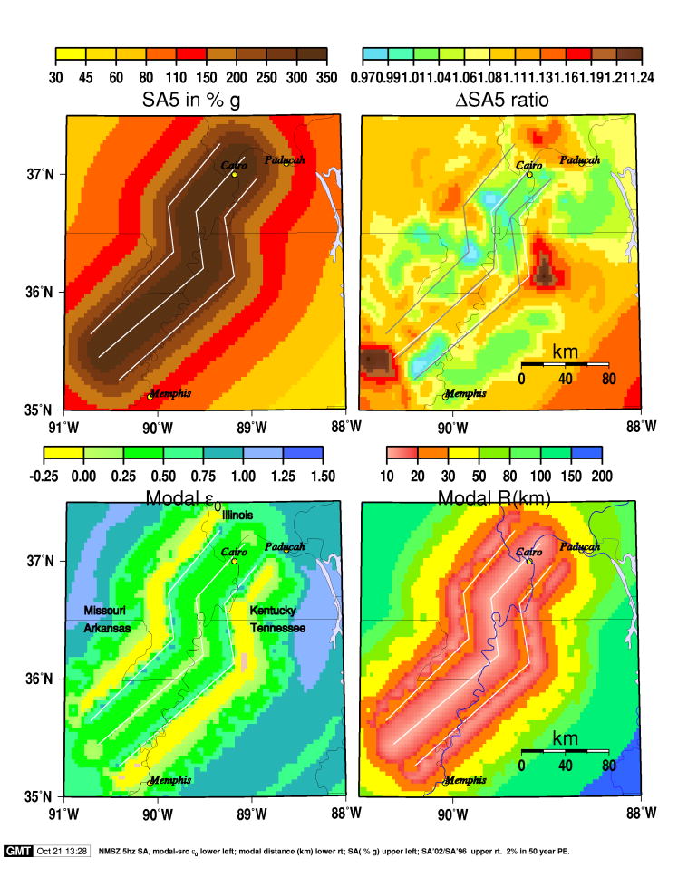
| Figure 32 exhibits some details of the new PSHA model for the NMSZ region and the 5-hz SA, for the 2% in 50 year PE. The upper left map of Figure 32 is the 5-hz SA in percent g. The white lines represent the range of locations used to model the NMSZ fault(s). The central fault trace follows the epicenter trend of monitored microseismicity (Frankel et al., 2002). The probabilistic motion within 10 to 20 km of the central trace exceeds 300% g and the motion within a few km of the eastern and western traces exceeds 250%g. At a distance of 150 km, the 5-hz probabilistic SA has dropped to about 40% g, an 8-fold decrease compared to the maximum on the central trace. For rock sites in Memphis, Tennessee, the probabilistic motion exceeds 110% g. |
| The upper right map of Figure 32 compares the probabilistic 5-hz SA for 2002 with that of the 1996 maps by plotting their ratio, SA(2002)/SA(1996) (1 represents no change). In general there is a slight increase in g.m. for 2002, rarely exceeding 30% g in the region shown. At most locations in the mapped region, the increase is less than 10% g. The gray fault traces in this figure are at the locations of the three NMSZ faults in the 1996 PSHA, while the white fault traces correspond to the 2002 PSHA. The change in location of the eastern trace as well as the greater weight assigned to the middle trace in the 2002 model explain the increase in 5-Hz SA shown in this figure, which in two spots exceeds 20%. |
| The modal-event magnitude everywhere in the mapped region of Figure 32 is M7.7. The lower left map of Figure 32 is the modal-event e0 for the 5-hz SA and the 2% in 50 year PE. The three NMSZ possible fault locations are again shown as white lines. At most locations e0 is greater than 0, meaning that the 2% in 50 year motion exceeds median motion from potential NMSZ M7.7 mainshocks. There are yellow bands just outside the eastern and western traces, indicating locations where modal-source e0 is slightly less than zero. |
| The lower right map of Figure
32 is modal-source distance ( |
South Carolina Modal Source Parameters |
| Parts of South Carolina have relatively high probabilistic ground motion, second only to that at sites near the NMSZ in the CEUS. Large probabilistic motion results from the relatively short mean recurrence time of the 1886 -like characteristic earthquake, 550 years in the 2002 PSHA model. Owing to the low rate of seismic attenuation in the CEUS, the influence on probabilistic ground motion of the Charleston source is great throughout South Carolina and other southeast U.S. states. With respect to impact on PSHA maps, the main new feature of the 2002 update in the vicinity of the South Carolina coastal plain is the inclusion - with 50% weight - of a narrow zone of Charleston-like seismic sources, areally the same as the south Zone of River Anomalies, or ZRA of Marple and Talwani (2000). The updated hazard model mean recurrence time of the Charleston-like source is shorter than the 650-year estimate used in the 1996 model calculations, also resulting in an increase in probabilistic SA and PGA. |
| Figure 33 is a four-map examination of the new seismic hazard for 0.2-s SA, and 2% in 50 year PE in South Carolina and vicinity. The upper left map is the 5-Hz probabilistic SA, which can exceed 200% g in the ZRA (the "narrow zone"). The upper right map is the ratio SA(2002)/SA(1996). The most notable feature is the increase in 5-Hz SA in the narrow zone, a change of up to 40%, or in units, 60% g to 80% g. This map also shows that in spite of the shorter Charleston mainshock recurrence time, several factors more than counterbalance the rate effect to produce a net decrease in 5 Hz probabilistic motion by a small amount (generally 0 to 10% g) in most of the state away from the ZRA. These factors include (1), a more comprehensive set of ground-motion attenuation models, (2), the greater average distance to the Charleston source for sites sufficiently far from the ZRA, and (3), truncation of sa at m+3s. |
| In the 2002 update, there is a distribution of magnitude (i.e., logic tree) for Charleston sources, ranging from M6.8 to M7.5, discussed in Frankel et al (2002), whereas in the 1996 PSHA, Charleston-source M was fixed at 7.3. It is not transparent whether the 2002 M distribution increases or decreases probabilistic motion relative to the fixed-M model. Analysis indicates that for the 2% in 50 year PE, the distribution of M with weights as defined in the 2002 update decreases probabilistic SA and PGA by up to a few percent compared to using the fixed-M Charleston source model, for sites throughout South Carolina and vicinity. The decrease is greatest in the Coastal Plain. |
| The lower left map of Figure
33 is 5-hz SA modal-source magnitude, or |
| The lower right map of Figure
33 is the 5-hz SA modal-source distance, or |
Conclusions and Discussion |
| Sensitivity studies about features of regionally dominant sources, such as that of Cramer (2001), suggest that such analysis can provide useful information to those who make decisions on research priorities and hazard mitigation strategies. That is, increments in knowledge and understanding of some features of such dominant sources, such as fault location, recurrence rate, and so on, may have greater impact on estimates of probabilistic ground motions than other increments, and may therefore merit more research effort. Deaggregation analysis can be used to determine these sources, the degree of dominance, for example MCF maps like Figure 16, and the basis for their dominance, including the ground-motion prediction equations that may be pivotal in making such a determination. |
| The 2002 USGS PSHA update often yields the same or similar modal sources as the 1996 USGS PSHA. This may be verified by comparing the maps of this report with those of Harmsen et al (1999) and Harmsen and Frankel (2001). Many hazard details have changed, some of which are visible on nation-scale maps, but most of which are best appreciated by performing site-specific seismic hazard deaggregation. At the 2002 interactive deaggregation web site, http://eqint.cr.usgs.gov/eq/html/deaggint2002.html, the user may perform these deaggregations and learn about new and modified sources. Several new or previously unused attenuation models have also been included in the 2002 USGS PSHA. Although their effects are in the results, we have not attempted in this report to deaggregate hazard from different attenuation models. |
| PSHA maps may change significantly when additional research and understanding
indicate the need to modify strong-motion attenuation models and/or seismic
sources, e.g., their location, their size, and their likelihood of occurring
in a random or specific future period. The most obvious way to document
the impact of these changes is to present maps of differences or ratios
of probabilistic motion, as has been done in s. 22, 32, and 33 of this
report. The change in mean e0 , such as that presented in Figure
9, is a less obvious indicator of changes in PSHA map input
data. However, maps such as Figure
9 may complement other comparison maps, such as ratios of |
| One purpose of deaggregation analysis is to find plausible (R,M) pairs from which to choose accelerograms, A(t), for input to seismic design programs for structural response. If one chooses A(t) corresponding to the mean (R,M), at many sites and for the 2% in 50 year (or other) PE, the accelerograms will tend to yield spectral accelerations that are significantly lower than the probabilistic spectral acceleration, as in Eqn. (5) above. Therefore, it is frequently necessary to scale seismograms to the probabilistic motion. |
| While the mean is an important parameter for characterizing a statistical distribution, its usefulness has been challenged in the seismic-resistant design application for another reason. For sites that have multimodal hazard distributions, the mean magnitude, distance pair can represent a source that has little or no probability of occurrence. For example, at Portland Oregon, the mean (M, R) for 1-s SA and the 2% in 50 year PE is (7.5, 50 km), an "amalgamation" of local sources at lower magnitudes and much more distant subduction sources having M8.3 or M9. This multi-modal feature could conceivably result in an undesirable choice of earthquake A(t) to resist if design decisions are tied very closely to resisting certain (M,R) pairs, such as the mean (M,R), but not others for a given SA and PE. The maps of mean magnitude, distance, and e0 presented here are intended to convey information about the distribution of probabilistic seismic sources rather than to provide prescriptions or suggestions for seismic sources to use in building design or retrofit projects. |
| The information of deaggregation analysis can and perhaps should be considered in a complex seismic-resistant design decision-making environment. |
Figures |
Figure 1. Maps of modal-event magnitude (or Mhat) in the western U.S. for the PSHA model of Frankel et al. (2002), for the 2% in 50 year probability of exceedance. Left side, for 1.0-s spectral acceleration. Right side, for 0.2-s, or 5-Hz, spectral acceleration. Figure 2. Maps of modal-event distance (or Rhat) in the western U.S. for the PSHA model of Frankel et al. (2002), for the 2% in 50 year probability of exceedance. Left side, for 1.0-s spectral acceleration. Right side, for 0.2-s, or 5-Hz, spectral acceleration. Figure 3. Maps of modal-event ε0 (or epsilon-sub-zero) in the western U.S. for the PSHA model of Frankel et al. (2002), for the 2% in 50 year probability of exceedance. Left side, for 1.0-s spectral acceleration. Right side, for 0.2-s, or 5-Hz, spectral acceleration. Figure 4. Maps of modal-event magnitude in the western U.S. for the PSHA model of Frankel et al. (2002), for the 2% in 50 year probability of exceedance. Left side, for 2.0-s spectral acceleration. Right side, for 0.1-s, or 10-Hz, spectral acceleration. Figure 5. Maps of modal-event magnitude in the western U.S. for the PSHA model of Frankel et al. (2002), for peak horizontal ground acceleration, or PGA. Left side, for the 2% in 50 year probability of exceedance. Right side, for the10% in 50 year probability of exceedance. Figure 6. Maps of modal-event distance in the western U.S. for the PSHA model of Frankel et al. (2002), for peak horizontal ground acceleration, or PGA. Left side, for the 2% in 50 year probability of exceedance. Right side, for the10% in 50 year probability of exceedance. Figure 7. Maps of mean-event magnitude (or Mbar) in the western U.S. for the PSHA model of Frankel et al. (2002), for the 2% in 50 year probability of exceedance. Left side, for 1.0-s spectral acceleration. Right side, for 0.2-s, or 5-Hz, spectral acceleration. Figure 8. Maps of mean-event distance (or Rbar) in the western U.S. for the PSHA model of Frankel et al. (2002), for the 2% in 50 year probability of exceedance. Left side, for 1.0-s spectral acceleration. Right side, for 0.2-s, or 5-Hz, spectral acceleration. Figure 9. Maps of mean-event ε0 (or epsilon-sub-zero) in the western U.S. for the PSHA model of Frankel et al. (2002), for the 2% in 50 year probability of exceedance. Left side, for 1.0-s spectral acceleration. Right side, for the change in mean ε0 from that associated with the previous PSHA model of Frankel et al. (1996). Figure 10. Map of modal-event magnitude (or Mhat) in the California-Nevada region for the PSHA model of Frankel et al. (2002), for the 2% in 50 year probability of exceedance and for 1.0-s spectral acceleration. Light gray is used to denote areas where the dominant seismic-hazard source is Cascadia M9 megathrust. Medium and dark gray are used to denote regions where the dominant seismic-hazard source is a large San Andreas fault earthquake. Figure 11. Map of modal-event distance (or Rhat) in the California-Nevada region for the PSHA model of Frankel et al. (2002), for the 2% in 50 year probability of exceedance and for 1.0-s spectral acceleration. Gray is used to denote regions where a nearby fault is the dominant source of seismic hazard. Figure 12. Map of modal-event ε0 (or epsilon-sub-zero hat) in the California-Nevada region for the PSHA model of Frankel et al. (2002), for the 2% in 50 year probability of exceedance and for 1.0-s spectral acceleration. Figure 13. Map of modal-event magnitude (or Mhat) in the California-Nevada region for the PSHA model of Frankel et al. (2002), for the 2% in 50 year probability of exceedance and for 0.2-s or 5-Hz spectral acceleration. Figure 14. Map of modal-event distance (or Rhat) in the California-Nevada region for the PSHA model of Frankel et al. (2002), for the 2% in 50 year probability of exceedance and for 0.2-s or 5-Hz spectral acceleration. Figure 15. Map of modal-event ε0 (or epsilon-sub-zero hat) in the California-Nevada region for the PSHA model of Frankel et al. (2002), for the 2% in 50 year probability of exceedance and for 0.2-s or 5-Hz spectral acceleration. Figure 16. Maps of mode-contribution-factor for California-Nevada region. Bottom left, for 1-s SA and for 2% in 50 year probability of exceedance. Bottom right, for 1-s SA and for 10% in 50 year probability of exceedance. Top left, for 0.2-s SA and for 2% in 50 year probability of exceedance. Top right, for PGA and for 2% in 50 year probability of exceedance. Yellow to orange colors indicate that one source or a narrow range of sources (in magnitude and distance) contribute the majority of the seismic hazard. A light blue color indicates that many sources, over a broad range of magnitudes and/or distances, contribute to the seismic hazard at the site. Figure 17. Map of modal-event magnitude (or Mhat) in the Pacific Northwest, principally Washington and Oregon, for the PSHA model of Frankel et al. (2002), for the 2% in 50 year probability of exceedance and for 1.0-s spectral acceleration. A white color is used to denote areas where the dominant seismic-hazard source is Cascadia M9 megathrust. Quaternary fault traces are gray. Figure 18. Map of modal-event distance (or Rhat) in the Pacific Northwest, principally Washington and Oregon, for the PSHA model of Frankel et al. (2002), for the 2% in 50 year probability of exceedance and for 1.0-s spectral acceleration. Quaternary fault traces are white. Figure 19. Map of modal-event ε0 (or epsilon-sub-zero hat) in the Pacific Northwest, for the PSHA model of Frankel et al. (2002), for the 2% in 50 year probability of exceedance and for 1.0-s spectral acceleration. Quaternary fault traces are white. Figure 20. Map of modal-event distance (or Rhat) in the Pacific Northwest, principally Washington and Oregon, for the PSHA model of Frankel et al. (2002), for the 2% in 50 year probability of exceedance and for 0.2-s spectral acceleration. Quaternary fault traces are white. Figure 21. Graphs depicting probabilistic seismic-hazard for a site in Portland, Oregon using the PSHA model of Frankel et al. (2002). All graphs are for 1-s spectral acceleration. Lower left, mean seismic hazard from all sources (solid curve) and for the modal source (dashed curve). Upper left, mean-event distance (km) (solid curve) and modal-event distance (dashed curve). Upper right, mean-event magnitude (M) (solid graph) and modal-event magnitude (dashed curve). Lower right, mean-event epsilon-sub-zero (ε0) (solid curve) and modal-event epsilon-sub-zero (dashed curve). Figure 22. Maps of probabilistic 1-s spectral acceleration (or SA, units: g) for the Intermountain Seismic Belt region and for the 2% in 50 year probability of exceedance. Left side, for the PSHA model of Frankel et al. (2002). Right side, change in 1-s SA from the model of Frankel et al. (1996), mapped as the difference SA1 (2002) � SA1(1996). Figure 23. Maps of deaggregated seismic hazard parameters for the Intermountain Seismic Belt region for 1-s SA, and for the 2% in 50 year probability of exceedance. Left side, modal-event magnitude. Right side, modal-event distance (km). Quaternary fault traces are white. Figure 24. Maps of modal-event magnitude (or Mhat) in the central and eastern U.S. for the PSHA model of Frankel et al. (2002), for the 2% in 50 year probability of exceedance. Left side, for 1.0-s spectral acceleration. Right side, for 0.2-s, or 5-Hz, spectral acceleration. Possible New Madrid fault locations are shown as three white traces. Figure 25. Maps of modal-event distance (R) in the central and eastern U.S. for the PSHA model of Frankel et al. (2002), for the 2% in 50 year probability of exceedance. Left side, for 1.0-s spectral acceleration. Right side, for 0.2-s, or 5-Hz, spectral acceleration. Figure 26. Maps of modal-event ε0 (or epsilon-sub-zero hat) in the central and eastern U.S. for the PSHA model of Frankel et al. (2002), for the 2% in 50 year probability of exceedance. Left side, for 1.0-s spectral acceleration. Right side, for 0.2-s, or 5-Hz, spectral acceleration. Figure 27. Maps of modal-event magnitude (or Mhat) in the central and eastern U.S. for the PSHA model of Frankel et al. (2002), for the 2% in 50 year probability of exceedance. Left side, for 2.0-s spectral acceleration. Right side, for 0.1-s, or 10-Hz, spectral acceleration. Possible New Madrid fault locations are shown as three white traces. Figure 28. Maps of modal-event ε0 (or epsilon-sub-zero hat) in the central and eastern U.S. for the PSHA model of Frankel et al. (2002) for peak horizontal ground acceleration, or PGA. Left side, for the 2% in 50 year probability of exceedance. Right side, for the 10% in 50 year probability of exceedance. Figure 29. Maps of mean-event magnitude (or Mbar) in the central and eastern U.S. for the PSHA model of Frankel et al. (2002), for the 2% in 50 year probability of exceedance. Left side, for 1.0-s spectral acceleration. Right side, for 0.2-s, or 5-Hz, spectral acceleration. Figure 30. Maps of mean-event distance (or Rbar) in the central and eastern U.S. for the PSHA model of Frankel et al. (2002), for the 2% in 50 year probability of exceedance. Left side, for 1.0-s spectral acceleration. Right side, for 0.2-s, or 5-Hz, spectral acceleration. Figure 31. Maps of mean-event ε0 (or epsilon-sub-zero bar) in the central and eastern U.S. for the PSHA model of Frankel et al. (2002), for the 2% in 50 year probability of exceedance. Left side, for 1.0-s spectral acceleration. Right side, for 0.2-s, or 5-Hz, spectral acceleration. Figure 32. Deaggregated seismic hazard for 0.2-s spectral acceleration with 2% in 50 year probability of exceedance in the New Madrid Seismic Zone and vicinity. Top left, spectral acceleration (units, g) for PSHA model of Frankel et al. (2002). Top right, difference in spectral acceleration from the PSHA model of Frankel et al. (1996). Bottom left, modal-event ε0 (or epsilon-sub-zero hat). Bottom right, modal-event distance (or Rhat, units: km). Possible locations of NMSZ fault system are shown as three white traces. Figure 33. Deaggregated seismic hazard for 0.2-s spectral acceleration (or SA) with 2% in 50 year probability of exceedance in South Carolina and vicinity. Top left, spectral acceleration (units, g) for PSHA model of Frankel et al. (2002). Top right, difference in spectral acceleration from the PSHA model of Frankel et al. (1996) expressed as the ratio SA(2002)/SA(1996). Bottom left, modal-event magnitude. Bottom right, modal-event distance (units: km). Rivers are shown as blue lines. |
| AccessibilityFOIAPrivacyPolicies and Notices | |
| |
|