U.S. Geological Survey Open-File Report 2005-1428
Digital Mapping Techniques '05—Workshop Proceedings
Pennsylvania Bureau of Topographic and Geologic Survey,
3240 Schoolhouse Road,
Middletown, PA 17057
Telephone: (717) 702-2017;
Fax: (717) 702-2065;
e-mail: twhitfield@state.pa.us
Land development pressures in glaciated northeastern Pennsylvania and the Poconos have resulted in a great demand for information about the surficial deposits of the area. Surficial deposit mapping of this area has been an on going STATEMAP project for many years (STATEMAP is a component of the USGS National Cooperative Geologic Mapping Program). Two or three 7.5-minute USGS quadrangles are usually mapped each year. Until recently, finished (but not finalized) map projects consisted of a text report and one or more clear or greenline mylar quadrangle maps. A finished map project is one in which the author has completed his or her fieldwork, maps, and documentation, and has had a minimum level of review. A finalized map project is one that has had a more formal review and has met all the standards necessary for formal publication. Surficial geology contact lines, isochores, bedrock outcrop ledges, etc. were drafted directly onto mylar maps or on mylar overlays. Other features were hand drafted or rub-on transferred to the mylar sheets.
The initial intent was to release these maps as formal publications at a later date, but given the demand for the data, they were released in the open file series. Each open-file report consisted of large, at-scale photocopies of the mylar maps and various overlay combinations, in widely varying quality, and a copy of the report.
When GIS and digital map data began to be widely used in the 1990's, users began to request these maps in a digital format, preferably as a georeferenced GIS file. Early attempts to convert the mylar maps to digital were problematic. Many of the greenline mylars had black ink contact lines drafted directly on them. Scanning these maps and separating the drafted line from the background was very difficult. Most of the digitizing had to be done by hand.
New and improved scanning techniques and software solved the problem of capturing lines drafted directly on a greenline mylar. Drafted lines are captured at the scanning station and saved as a separate binary image. A binary image is a raster image with just two values. Each pixel is either a one (1) or a zero (0). Improved auto-vectorization software (ESRIs ArcScan 9.x) that also allowed interactive image editing was also a great step forward. ArcScan reduced the digitization process by several days.
This particular open-file series of maps is now completely digital. When new maps are released, they include many different georeferenced and attributed data layers and data-sets, instead of one or two large photocopies of the originals. Also included is a PDF file of the finished map for those who wish to print their own copy.
Heads-up digitizing of a scanned image is generally a straightforward process, but can consume many hours. Automated or semi-automated digitizing speeds the process up considerably. For successful tracing, however, most automated digitizing programs require a binary or black and white image. The line tracer will follow pixels with ones or zeros, but not number ranges associated with color designations. Producing a usable binary image from a greenline mylar can be a difficult task.
The key to getting a good scan of a mylar is good contrast. Because a mylar is translucent, the scanner will often pick up the color of the hold-down bar behind the mylar as it is scanned (Figure 1). If the hold-down is white, then there usually won't be a problem. But, more often the paper hold-down is pitted, scratched, and discolored, and therefore it does not make a good contrasting background for images on the mylar. Creating a sheath out of a folded piece of clear acetate, then putting a scrap piece of white plotter paper inside the sheath, behind the mylar, makes an excellent mylar scanning "packet" (Figure 2). The mylar then has a solid white background for contrast, and the sheath keeps everything together. This type of sheath is also good for scanning worn, tattered, or delicate maps. It protects the maps from friction associated with the hold down bar and traction friction from the scanner rollers (Figure 3), and it lets you carefully piece a tattered map back together, keeping loose map pieces in place while being scanned.
Practicing good scanner hygiene is equally important and will prevent problems in the future. The scanned media should contain no tape, glue, or staples. Tape and glue residue can transfer to the scanner glass, causing streaks and lines to appear in the scanned image, and also can be transferred to other originals that are scanned. Staples can permanently scratch the surface of the glass. Scanner glass is optical quality glass and is often softer than normal plate glass and can be quite costly to replace. Also, the scanner cameras have a precise focal field and they focus on the upper surface of the scanner glass. Any glue, debris, or scratches on the glass can adversely affect the quality of the scanned image. Always check the scanner glass for foreign matter, and clean regularly. Also ensure the mylar or other original map is free of dirt, eraser dust, etc. A horsehair drafting brush is great for dusting off originals.
Drawing a line on mylar with a drafting pen is not difficult, but getting consistent ink line quality can be. Because mylar does not absorb the ink as paper does, the drafted lines can vary in thickness and density. Lines can be thick and dark in some places, and thin and light in others. These variations in the drafted lines can make it difficult to capture them in a consistent manner. The lines in Figure 3 appear to be consistent. Their variations, however, will not become apparent until the mylar is scanned.
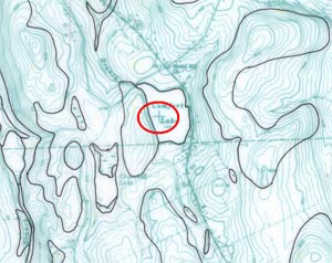
One other detail we nearly overlooked in this project was the preservation of control points or tic marks on each map. All the line work on a greenline mylar is of a 7.5-minute topographic map is, of course, colored green, including the tic marks (Figure 4). Because the objective of scanning the greenline mylars was to make the green lines disappear, we had to either draft the tic marks onto the mylars in black, or use black rub-on transfers to ensure we retained control points on the scanned images. Usually the other mylar overlays had the tic marks already on them. If they did not, we used a light table to manually add the control points.
 |
 |
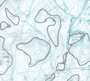 |
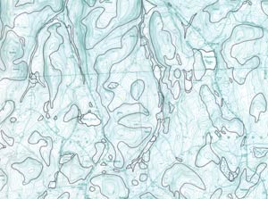
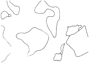
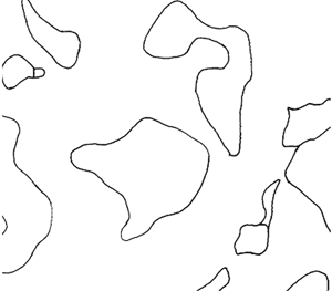
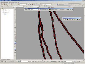
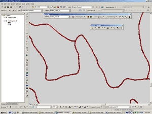
Figure 1. Surficial geology contact lines drafted directly onto a greenline mylar. |
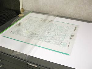
Figure 2. Folded clear acetate sheath for scanning. A sheet of plotter paper is placed behind a greenline or overlay mylar to provide a white background for contrast. This set-up is also good for protecting fragile maps from friction involved in the scanning process. |
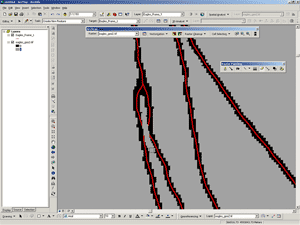
Figure 3. A closer look of the surficial geology contact lines drafted directly on a greenline mylar. The variable line quality is there, but not easily seen. |
 |
 |
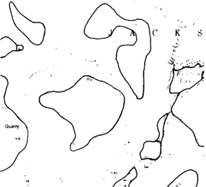 |
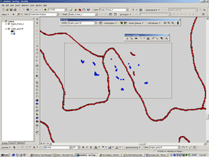
Figure 4. Location control points (tic marks) on the greenline base map are colored green. In order not to lose the control points when the green lines are deleted from the mylar base during scanning, they had to be redrawn in black. Note the location of the green tic mark inside the circle, northwest of the "L" in Comfort Lake. This tic mark had to be changed to black before scanning. |
Figure 5. Setting the threshold too high causes the background and noise to drop out, but often fails to retain fainter parts of the contact lines. |
Figure 6. Setting the threshold too low picks up unwanted background lines from the greenline, and "noise" along with the geologic contact lines. |
 |
||
Figure 7. The automatic thresholding option effectively dropped out the greenline background and noise while preserving fainter drafted contact lines. |
During the scanning operation, a threshold setting determines the sensitivity of the scanner. The threshold sets the values that the scanner uses for dividing tonal ranges into black and white output. Setting the threshold high enough to drop out the greenline background and noise in one area may cause fainter black lines to be dropped out in another area (Figure 5). Setting it too low will increase noise (speckling) and will pick up unwanted background lines (Figure 6). Finding the right setting often involves a lot of trial and error.
Many of the newer scanning interfaces have an automatic thresholding feature. During the scanning process, the scanner will analyze small sections of the object map and determine the optimal threshold setting for that section within a variability range set at the interface. By independently varying the threshold for each section of the object map, noisy areas are cleaned up and light or faded object lines are more reliably detected. Although this process was designed for maps such as blue-line ozalids where print quality can vary widely across the map and for older maps that tend to degrade to a yellowish color, it worked very well for us in dropping the greenline background from our mylars while preserving the black contact lines (Figure 7).
We used a Vidar Titan II scanner (http://www.vidar.com/wideformat/). It is a color scanner capable of scanning maps up to 40-inches wide and (assumed) unlimited length. It has a dual roller feed, three cameras, and an optical resolution of 400 dpi. The dpi can be increased in the software, but anything above the optical resolution of the cameras is done through software interpolation. The scanning software we used is Vidar TruInfo v1.4.6, which was supplied with the scanner. The scanner and software were purchased in 2000 and there have not been any updates to the software since then.
File size and image formats can become significant issues during scanning. We found that the easiest and safest image format to use is TIFF. It is a very common image format, and is easily read by most GIS and image software packages. File size varies by the image format chosen, but more significantly by the resolution (dpi, or dots per inch) chosen for the scanner. "Dpi" is somewhat of a misnomer when applied to images. Dpi is more appropriate when working with inkjet plotters to specify how much ink per linear inch the plotter will "dot" on the paper. Dpi when applied to images designates how many pixels a scanner will record in an inch of measure. The higher the dpi, the more (and subsequently smaller) pixels the scanner will fabricate in an inch in both the x and y directions. As the pixels get smaller, the resolution and defined detail of the image increases, as well as file size, sometimes exponentially. Image dpi settings of 300 or 400 are usually more than adequate for most uses. Higher dpi settings result in large, unwieldy files that are difficult to handle and have little or no noticeable gain in clarity. In our case, we worked primarily with 300 and sometimes 400 dpi images. The 400 dpi setting was used for mylars where the contact lines were very close together. The increase in detail kept close lines from melding together. Also, as noted above, the cameras of our scanner have a resolution maximum of 400 dpi; therefore, dpi settings above 400 can only be achieved by software re-interpolation.
When we completed the mylar scanning process, we moved the TIFF image files over to a workstation for further processing. Although we could have vectorized the scanned images, we found it more efficient to first georeference the images to the appropriate map projection. It saves time later, and allows us to compare it to other georeferenced data layers during the vectorization process. We used the georeferencing module in ArcGIS 9.x, with a pre-defined 2.5-minute point grid coupled with a 7.5-minute quadrangle boundary line grid. Each image was brought in to ArcGIS and geo-referenced to the 16 control points (2.5-minute tic marks) on each scan (Figure 8).
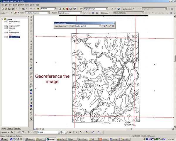
Figure 8. Using ArcGIS to georeference the scanned image to a 2.5-minute point grid and 7.5-minute quad boundary data set. The projection is set to match the projection of the original map.
We used the ArcScan extension module of ArcMAP 9.0 and 9.1 for line vectorization. ArcScan was an optional module in ArcMAP 8.x through 9.0, but has been made a part of the core functions in version 9.1. ArcScan is also a module available in Arc/Info Workstation 7.x and higher, but the only similarity is that the Workstation version does trace lines. The ArcMAP version of ArcScan is a vast improvement over the Workstation version.
ArcScan draws vector lines based on how it traces contiguous raster pixels. In order for ArcScan to trace contiguous pixels, they must be the same value, and surrounding pixels must have a contrasting value. As a result, ArcScan will only work on binary images where values are either 1s or 0s (zeros). It cannot distinguish single pixel values (or near the same color values) from 256-color raster color, grayscale, or 3-band color (RGB or CMYK) images.
Once the georeferenced image has been brought into ArcMAP, it is best to change the classification designation (found under the symbology tab) to unique values. It does not matter what colors the user designates to represent the 1s and 0s on screen, as long as there are only two values on the scanned image.
Raster line intersections have always been one of the hardest things for ArcScan (or any vectorization software) to interpret. "T" intersections would commonly have a deep "V" in them where the tracer would move to the geographical center of the pixel cluster in the middle of the "T" before continuing down the pixel line. ArcScan now offers new intersection solutions under the vectorization settings: geometrical, median, and none. The "geometrical" option tries to preserve angles and straight lines; in other words, it tries to keep "T" intersections as "T" intersections. "Median" is designed to work for non-rectilinear angles; this is presumably for use in depicting natural resources where right angles are rarely observed. "None" is designed for nonintersecting features like contours, etc. Although one would assume that the median option is best for our use, we found the geometrical option gave far better results with less clean up needed.
ArcScan also has problems tracing lines intersecting at low angles. Often there are pixel in-fills between the lines as they approach the actual line intersection (Figure 9). The tracer interprets the line intersection to be somewhat short of its actual location and at a larger angle than intended. This problem can be addressed by the interactive raster editing capabilities of ArcScan.
The interactive raster editing module and the tracing preview option, used in conjunction with each other, are by far the biggest time savers of the ArcScan extension. The interactive raster editor allows the user to edit the raster image on the fly. Pixels can be erased or filled individually, in blocks, by "painting" (Figure 10), or by a number of different options. The preview option shows the user how ArcScan intends to vectorize the pixel lines as they are shown on the screen. The vectorization preview can be set to refresh after each raster edit. If the user erases a number of pixels at once, after the mouse key is released, the preview will refresh to show how the vectorizing will change. The user can then tweak individual pixels, if necessary, to obtain the best results. Raster editing not only gives the most optimal vectorization results, thereby reducing clean up, but also produces in a very clean raster image (Figure 11).
Another of the raster editing tools that is actually fun to use is the "magic eraser". The magic eraser interactively erases connected pixels. It will erase a feature by touching it or by drawing a box around it. This is quite useful if, for example, a name happens to appear on the scan. Touch it or surround it, and the name disappears. The magic eraser, however, will not erase a pixel string if it passes through the magic eraser bounding box. This is quite useful if there are a number of random dots (noise) appearing on both sides of a contact line. To erase the noise, simply surround the noise with a magic eraser bounding box, making sure the contact line passes through the bounding box, and the noise within the box is erased leaving the contact line intact (Figures 12 and 13).
Once the raster editing was done, we used the ArcScan batch vectorization feature to vectorize the entire scan (Figure 14). We could have used the interactive tracing tool to digitize the images; it operates in a manner similar to the interactive tracing tool in Arc/Info Workstations ArcScan and requires tweaking of the detection and direction settings to actually get it to run smoothly. The interactive tracer will follow a pixel line until it encounters an intersection or a cluster of pixels with an unclear exit. It then waits until the user decides which way the tracer should go. This interaction continues until the scan, or parts thereof, are vectorized. We found the batch vectorization and subsequent minor clean up to be much less time-consuming than interactive vectorization.
The vectorization results were very good, but some final clean up was necessary. It was easier to do clean up at this stage than after the data set had been converted to polygons (e.g., only one line is being edited at a time, so there is no danger of creating sliver polygons; also, discontinuous lines are more easily edited). Checking the topology for each scanned map layer or theme is very important. We did not want dangling lines or disconnected lines (undershoots) present before creating polygons. We also did not want lines that self-intersect or overlap themselves or other lines. Bypassing this step can lead to hours of corrections later. Points and other features can be hand-digitized into their own data files. Line and point placements should be checked for accuracy against the scanned images and corrected where necessary.
Once we were satisfied with the positioning of these features, and the data sets were free of errors, we then converted the appropriate line files to polygon data sets (Figure 15). Converting line data to polygons in ArcGIS can be done in two different ways with the same results. In ArcMap, there is a "construct polygons from line features" button on the topology toolbar. In ArcCatalog, the construct polygons from line features option is found by right clicking the "new" tab. A new polygon feature class is created without destruction of the original lines data set.
Although it may seem redundant, it is a good idea to create and maintain a topology rule set on the newly created polygon data set. Sliver polygons, polygon gaps, and overlaps, etc., are rare just after creating the polygon data set, but an inadvertent, undetected move of a polygon during attribution or other editing process can create problems later.
Assigning attributes to the various layers of the map project was a straightforward process. We created appropriate fields in each data sets attribute table and populated them accordingly (Figure 16). Extensive use of look up tables for many of the textural attributes saved a significant amount of time when assigning attributes. For example: we attributed the surficial geology layer, polygon by polygon, with just the geologic symbol (e.g., Qa, Qat, Qwic, etc.). We then used the join feature to link to a standard database containing a more detailed narrative field keyed to each geologic symbol. The resulting layer was then exported to a shapefile or geodatabase layer, making the joined narrative fields a permanent part of the data layer.
 |
 |
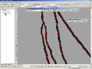 |
Figure 9. ArcScan module showing a preview of how the tracer will vectorize this area of the scan. The contact lines were very close, so when scanned, the pixellated lines merge into one. The vectorization tracer will try to cross the vector lines because the pixel lines are not separated. |
Figure 10. Interactively erasing the pixels between the lines. |
Figure 11. The tracer will now vectorize the area correctly. |
 |
 |
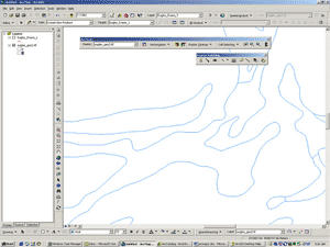 |
Figure 12. Random noise (dots) near a contact pixel line to be vectorized, surrounded by a "magic eraser" bounding box. |
Figure 13. Random noise shown in Figure 12 removed, leaving the contact pixel line intact. |
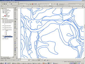
Figure 14. A newly-vectorized data set. |
 |
||
Figure 15. Polygon data set created from a line data set. |
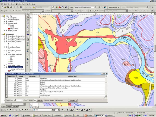
Figure 16. An attributed, symbolized, and completed polygon data set.
When we were satisfied with the vectorization and attributing of the various data layers, we made check plots of the maps and submitted them back to the authors for their review. Because this is such a large project, a generic map template was constructed in which any of the quads can be placed, with minimal editing and adjustment, and printed. In some cases, the authors made changes or clarifications to the data, which was edited accordingly. The completed maps and digital files were then submitted for internal review and approval.
We made the decision to release these maps as part of our Open File Series of publications; these publications have undergone a level of review, but have not been subjected to rigorous formal publication reviews. The purpose of these open-filing the maps is to quickly get them to our customers. Caveats apply to the data until they have undergone a more rigorous review and are formally published.
Data sets released to the public are in several digital formats including ArcGIS Geodatabases and shapefiles. For those using the digital data in ArcGIS, we include the ArcMap MXD (ArcMap document) file, and a PMF (ArcPublisher-created) file for use with ArcReader, a limited version of ArcGIS and free download from ESRI. A PDF of the map document is included for those not using GIS, or those who just want to print the map.
In northeastern Pennsylvania, we have more than 30 USGS 7.5-minute quadrangles with the surficial geology already mapped in analog form. Each quad has from 3 to 5 mylar overlays along with a greenline quad base. The greenline mylar base usually has one of the data layers, surficial geology, drafted directly on the mylar. Digitally lifting the surficial geology contacts from the greenline mylar was a challenge. By adapting scanning and rendering techniques designed for other purposes, we are able to successfully digitize the surficial geology data layer with minimal effort and in a timely manner.
The overall goal of this project was to get highly sought-after information to the general public quickly, and in a digital format. Although the user must be aware that the data has not been through the formal review process and is subject to change, it is still the best data available right now.

![]() U.S. Department of the Interior |
U.S. Geological Survey
U.S. Department of the Interior |
U.S. Geological Survey
URL: pubsdata.usgs.gov /pubs/of/2005/1428/whitfield/index.html
Page Contact Information: David R. Soller
Page Last Modified: Saturday, 12-Jan-2013 22:05:31 EST