 |
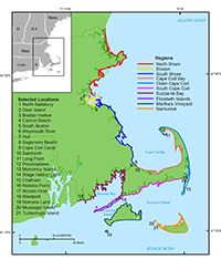
Figure 1. Index map of the Massachusetts coast showing the 10 geographic regions used to organize and publish the shoreline rate-of-change data in this report. |
 |
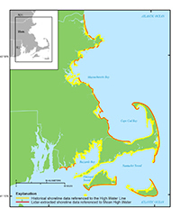
Figure 2. Map illustrating the extent of shoreline coverage for Massachusetts. Yellow lines represent historic shoreline data referenced to the high water line. Red lines represent lidar-extracted shoreline positions referenced to the mean high water line. |
 |
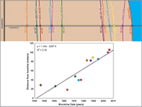
Figure 3. Example of a linear regression shoreline change rate calculation using a sample dataset. The rate was determined by plotting the shoreline positions with respect to time and calculating the linear regression equation of y = 1.34x – 2587.4. The slope of the equation describing the line is the rate (1.34 meters per year). Figure from Himmelstoss (2009). |
 |
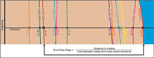
Figure 4. Example of an end point rate calculation using a sample dataset. The rate of 1.09 meters per year is the distance between the 2005 and 1936 shorelines (76.03 meters) divided by the span of time elapsed between the two shoreline positions (69.82 years). All other shoreline data are ignored in this computation. Figure from Himmelstoss (2009). |