

Using Visualization Science to Inform the Design of Environmental Decision-Support Tools—A Case Study of the U.S. Geological Survey WaterWatch
Links
- Document: Report (1.93 MB pdf) , HTML , XML
- Download citation as: RIS | Dublin Core
Acknowledgments
All three authors—Michael D. Gerst, of the University of Maryland; Melissa A. Kenney, of the University of Minnesota; and Emily Read, of the U.S. Geological Survey—designed the research and wrote this report. Michael Gerst and Melissa Kenney performed the research, and Michael Gerst analyzed the data. The authors thank Megan Hines and Jennifer Bruce (both of the U.S. Geological Survey) for creating control and treatment graphics, Charlotte Snow (Bureau of Reclamation) for providing technical input on the study, and Ellen Bechtel (U.S. Geological Survey) for designing illustrations for two public surveys administered to test the redesign of an established environmental decision-support tool, and Cee Nell (U.S. Geological Survey) for figure design. Melissa Kenney and Michael Gerst were funded by the U.S. Department of the Interior, U.S. Geological Survey grant G19AC00237 to the University of Minnesota, Water Resources Center.
Abstract
Environmental decision-support tools are increasingly being used to serve both expert and non-expert audiences. Many existing tools are primarily expert-focused, and redesigning them can be challenging because experts and non-experts interact with tools differently, existing users may be resistant to changes, and there is little guidance on how to prioritize redesign efforts and demonstrate their efficacy. In this report, we present a case study of a user-centered redesign of an established environmental decision-support tool—the U.S. Geological Survey WaterWatch. WaterWatch supports flood, drought, and other water resource management decisions through the display of water levels at gages across the United States. Using a participatory process, we identified a functional change (replacing the existing rainbow colormap), created an alternative design, and tested the alternative’s usability through two general public surveys. The results showed that replacing the rainbow colormap with a more intuitive diverging colormap improves usability, regardless of the audience’s subjective preference for the rainbow color scheme. In addition, we demonstrated the importance of using legends to improve the audience’s understanding of the map symbols. This study demonstrates how user-centered design approaches can be used to inform the design of high-profile products and tools.
Introduction
The increase in availability of digitized data, computational power, and faster connectivity has brought on an increase in online decision-support tools that are accessible by the public, providing more equitable access to environmental data and decision-making capacity (Ramachandran and others, 2021). However, many tools are developed to serve dual purposes of informing non-experts in the general public and being decision-support tools for expert users such as scientists, civil servants, and resource managers. Designing dual-purpose tools, especially those that rely heavily on visualization, can be a challenge because the general public and expert users may have different goals and approaches to interacting with scientific data visualization (Grainger and others, 2016; Harold and others, 2016; Zulkafli and others, 2017; Gerst and others, 202110). These differences in approaches are especially true for legacy data products, which may have decades of operational service, narrower expert-use cases, and older design standards. Existing users of legacy products are accustomed to certain workflows and design elements, and their needs often constrain the amount of change that can be incorporated into a redesign (Gerst and others, 2020).
When facing a redesign of a legacy product that is constrained by existing users’ expectations, designers can maximize the efficacy of each change, or at the least, help to ensure that changes will not reduce usability. A common approach is to make changes and refinements to graphics and features based on intuition and voluntary user feedback (Dasgupta and others, 2020). Although intended to increase the usability of these products, this approach has the potential to bias the prioritization of modifications toward a specific audience because it uses information from a small, vocal subset of users. Additionally, basing decision-support design on subjective feedback, especially for publicly important data products, may not always be a good predictor of whether a visualization is effective and understandable (Harold and others, 2016).
By learning from software developers, the designers of decision-support tools have increasingly adopted a combination of user-centered and agile approaches (McIntosh and others, 2011). User-centered and agile approaches emphasize beginning user engagement early, using iterative development to refine a tool, continuing engagement at frequent intervals, and using a mix of engagement techniques. Such engagement could include small sample-size techniques, such as individual observations of user interactions or focus groups (typically having fewer than 15 participants), or larger sample-size techniques, such as automated A/B testing on the web, which is limited only by the number of users who can be recruited (typically hundreds to thousands of participants). In A/B testing, users are given two options from which to choose. Agile approaches infuse development with flexibility and adaptability, while user-centered design reduces product risk by validating design decisions with users instead of relying on stakeholders or subject-matter experts to specify designs that may never be tested with representative users. In particular, doing more sample A/B testing through surveys can be useful for legacy products because the insights gained can provide additional evidence for potentially contentious changes, such as changing defaults or colormaps (Gerst and others, 2020, 2021).
While iterative inclusion of users in the design process can improve the eventual fit of the product, designs are informed by design guidelines and best practices in order to avoid inefficient use of resources and the potential adoption of a poor design (Adikari and others, 2009; Brhel and others, 2015). For designing interactive user interfaces, there are well-established options (Johnson, 2014), whereas for visualization, and in particular geovisualization, there are fewer guidelines. This lack of geovisualization guidelines exists largely because generalizing the complexity of interactively visualizing highly multidimensional data presents a significant challenge (Kelleher and Braswell, 2021; Terrado and others, 2022). However, if small, well-defined design problems are identified through the user-centered design process, then existing static visualization guidelines might be helpful in making design choices and setting up user studies (Dasgupta and others, 2015). When these opportunities arise, they can serve a dual purpose of aiding redesign and contributing to the visualization literature, because generating theories and design guidelines through user studies has been a long-standing challenge in geovisualization (Çöltekin and others, 2017).
In this report, we present such a case study, as applied to assessing and redesigning a legacy geovisualization product of the U.S. Geological Survey (USGS). An earlier study of the geovisualization product by Kenney and others (2024) described the first two phases of a usability process, which (1) included interviews with experts involved in the creation and use of the products and (2) diagnosed usability challenges. This report describes the third phase of the process, in which products redesigned on the basis of the outcomes of the first two phases were tested for efficacy and understandability. We focus on the USGS WaterWatch (https://waterwatch.usgs.gov), which provides map-based displays of current hydrologic conditions of streams and rivers of the United States to support flood, drought, and other water resource management decisions (Jian and others, 2008). The USGS also produced two companion products that depict current groundwater hydrologic conditions (Groundwater Watch, which was decommissioned in October 2022 and is no longer publicly available) and current water-quality conditions (WaterQualityWatch, available at https://waterwatch.usgs.gov/wqwatch). These three products, collectively referred to as “the Watches,” use color and symbology to give spatial descriptions of normal, above-normal, and below-normal conditions. WaterWatch was developed and released to the public before the two companion products, and it has been operational since the mid-2000s. It was chosen for this case study because of its longevity and because it has the highest user base of the Watches.
In interviews, designers of the Watches indicated that modernizing the visualizations in the products could be beneficial to a wider range of members of the public than those who currently used the products. The designers also emphasized that it was important to maintain the scientific basis and high-quality experience for technical users (Kenney and others, 2024). Of the potential design problems discussed in interviews, colormap choice was consistently identified as an element of the geovisualizations that could be revisited. This issue regarding colormap choices corroborated one of the major design problems identified in the second phase of our case study, which was described in Kenney and others (2024).
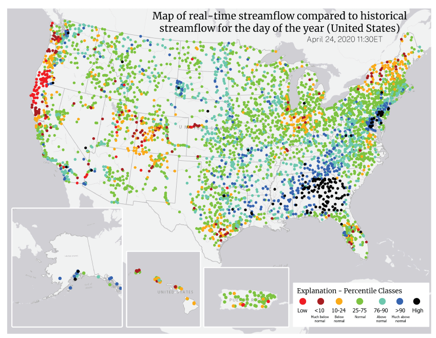
There is extensive use of the rainbow (also known as jet) colormap in hydrologic sciences, although there are known issues with its usage (Stoelzle and Stein, 2021). Consistent with this practice, the Watches use the rainbow colormap to indicate anomalies from normal streamflow (fig. 1). Color, when used effectively, allows people to correctly and quickly process information (Zeller and Rogers, 2020). Choosing an appropriate colormap is important because changes in hue may need more visual attention than changes in value or saturation and can imply thresholds or categories in the data. In addition, design experts generally recommend that colormaps monotonically and gradually change in perceived luminance (Crameri and others, 2020). By spanning the entire visual spectrum, a rainbow colormap can inadvertently imply more thresholds than necessary, and most rainbow colormaps have inadvertent peaks in perceived luminance at the yellow and turquoise hues (Quinan and others, 2019).

Screenshot of WaterWatch maps of the conterminous United States, Alaska, Hawaii, and Puerto Rico that depict streamflow anomalies by using the rainbow colormap to identify streamgages in seven percentile classes. The map group was accessed from https://waterwatch.usgs.gov/?id=ww_current on August 25, 2024. PR-VI, Puerto Rico and U.S. Virgin Islands. The U.S. Virgin Islands are not shown.
For the Watches, the rainbow colormap contains four hue changes, whereas the anomaly scheme used in the data is divergent and requires only two distinctions: between “above-normal to normal” and between “below-normal to normal.” A neutral color is used to represent “normal” conditions. In addition, the normal and lowest above-normal categories, which are adjacent, are both high luminance hues (bright green and turquoise).
Despite considerable research into its theoretical and observed efficacy, evidence of a rainbow map reducing usability is mixed and context-dependent. For example, previous work has shown that in a context where a divergent colormap is needed, the rainbow colormap performed significantly worse than an appropriately designed divergent colormap (Borkin and others, 2011), but in other contexts, it performed equivalently or better (Dasgupta and others, 2020; Reda and Szafir, 2021). Pervasive use of rainbow colormaps indicated that this kind of map is often used as a standard or default, which can affect users’ subjective perception of the rainbow colormap’s efficacy compared to redesigned colormaps. Additional research can help determine under what contexts the rainbow colormap is most useful. In particular, there is a need to test the use of rainbow colormaps in public-facing products using the general public as test respondents as opposed to expert users.
Research Questions Used To Test Changes From the Rainbow Colormap
As mentioned in the “Introduction,” we used the WaterWatch map as a case study in redesigning legacy geovisualization products. A multipart process began with (1) conducting interviews with the scientific producers of the Watches products (Kenney and others, 2024) and (2) using existing static visualization guidelines to identify potential design issues. In the work described in this report, we continued to the third step in the process (3) by selecting a well-defined problem common to phases (1) and (2) to do A/B testing through general public surveys. Using the following six research questions (RQ1 through RQ6), we tested whether changing a familiar feature, the rainbow colormap, improves product usability and the user’s subjective experience for the general public.
-
● RQ1: Do users have preconceived beliefs about how colors map to streamflow levels?
-
● RQ2: Does switching from the rainbow colormap to a brown-blue colormap affect the understandability of WaterWatch maps?
-
● RQ3: Is understandability enhanced by introducing users to the colormap legend?
-
● RQ4: Does switching from the rainbow colormap to a brown-blue colormap affect the efficiency of WaterWatch maps?
-
● RQ5: Is efficiency enhanced by introducing users to the colormap legend?
-
● RQ6: Do user preferences for the rainbow colormap or a brown-blue colormap align with objective measures of performance?
The results are used to provide both more context-based evidence on the efficacy of colormap choices and to provide guidance on user-centered design methods for legacy products.
Methods
U.S. Geological Survey Watches
The USGS is the primary Federal operator of hydrologic monitoring networks that are used to understand and predict drought, flood, and water availability conditions in the United States. The data are used by Federal agencies, scientists, and members of the public to make decisions about local, regional, and national water conditions.
The Watches provide maps, tables, and plots to describe real-time and historical hydrologic conditions. Information is updated as new data become available at the hourly to daily frequency, depending on the sampling frequency and data transmission rates. The map-based tools were designed and developed around internal audience requests and user feedback, and although they share some visual standards, they have been developed independently and without consistent approaches to the depiction of hydrologic conditions. In addition, the underlying technology bases are becoming more complicated to both maintain and upgrade, due to reliance on unsupported software tools. Therefore, extant visualizations have not been able to benefit from more recent advances in data visualization science, and there is an opportunity for future versions of the visualizations to improve the understandability, aesthetics, consistency, and potential utility across the Watches. To keep the study size tractable, we assessed only the streamflow anomaly maps from WaterWatch.
Respondent Recruitment and Initial Filtering of Responses
For Surveys 1 and 2, University of Maryland and University of Minnesota researchers [MDG and MAK] recruited respondents through the online survey company ROI Rocket, which maintains a verified database of potential respondents, and respondents were paid for their time. Sample sizes were designed to detect a point change of 10–15 percent in understandability. For Survey 1, which occurred during October 12–22, 2020, 556 questionnaires were completed. For Survey 2, which occurred during November 22–24, 2020, 511 questionnaires were completed.
A two-stage filter was applied to drop entries from respondents who might have completed the survey too quickly to provide adequate data. For the first filter, we examined the subset of respondents who correctly answered all questions and used the fastest respondent’s overall time and time spent on the eight search-and-click questions as a minimum threshold. For both surveys, the cutoff time for filtering out the search-and-click questions that were answered too fast was set at 1.5 minutes by the survey creators. Overall times for Surveys 1 and 2 are 5.5 and 4.5 minutes, respectively. We note that the software used to design the surveys, Qualtrics, estimated the average survey completion time to be around 7.5 minutes. Filtering out entries that did not meet both thresholds dropped 87 of 556 entries from Survey 1 and 46 of 511 entries from Survey 2.
During examination of the response data, we noted that a nontrivial number of respondents did not correctly understand one of the search-and-click question types, which required a respondent to click on a specific gage inside of a boxed region on the map. As a result, we applied a second filter to drop any entries by respondents who did not click inside the box. Doing so dropped an additional 57 and 28 entries from Surveys 1 and 2, respectively. Applying the two-stage filter led to overall drop rates of 26 percent and 14 percent and final sample sizes of 412 and 437.
Experimental Protocol and Materials
Respondents completed Surveys 1 and 2 online through a browser of their choice. The survey questionnaires were designed in Qualtrics and are provided in the dataset that supports this report (Gerst and others, 2025). The questionnaire for Survey 1 consisted of five parts: (1) warmup, (2) colormap sorting task, (3) search-and-click tasks to identify clusters of high, low, and transition (normal to above-normal) streamflows, (4) user preference questions, and (5) followup questions. The questionnaire for Survey 2 consisted of four parts: (1) warmup, (2) legend questions, (3) search-and-click tasks to identify clusters of high, low, and transition (normal to above-normal) gage locations, and (4) user preference questions. Parts 3 and 4 were the same across both surveys, whereas parts 1 and 2 varied in that Survey 2 primed respondents with some information about the legend prior to asking them to rank colors by hydrologic condition, whereas Survey 1 did no such priming.
For Survey 1, the warmup (part 1) started with a description of streamflow and the conventions of measuring streamflow with respect to a baseline normal. Next, respondents were presented with five precipitation events in randomized order: hurricane, afternoon thunderstorm, morning fog, one month without rain, and drought. In order to test understanding, they were then asked to rank the effect of the events on streamflow from highest to lowest. After ranking the events, respondents were shown the correct order.
Part 2 of Survey 1 was designed to test the intuitiveness of each colormap for representing streamflow. Respondents were presented with a scenario in which they were advising a map designer on how to use color to represent streamflow. The task randomly showed the respondent either a randomized rainbow colormap or a brown-blue colormap and then asked the respondent to rearrange the colors from highest to lowest streamflow. Once the arrangement was completed, the respondent was then shown the other colormap and asked to complete the same task.
For Survey 2, the warmup (part 1) also began with a description of streamflow and its measurement conventions. However, instead of respondents being asked to complete a practice ranking task, they were given more information about how the map legends related to color, percentiles, and the qualitative descriptors used on the maps (such as “much below normal”). Part 1 then presented a task where the respondent was randomly presented with either a rainbow legend or a brown-blue legend. While the legend was still visible, they were shown three multiple-choice questions, which asked the respondent to identify the colors representing normal, high, and low streamflows. Once the task was completed, the respondent was shown the legend with the other colormap and were asked the same multiple-choice questions.
Parts 3 and 4 were the same for Surveys 1 and 2. Part 3 consisted of two types of search-and-click tasks. One task type was designed to test how accurately and efficiently map users could identify clusters of gages recording high and low streamflow extremes, whereas the other task type was designed to test how accurately and efficiently map users could distinguish among clusters of gages recording normal, below-normal, or above-normal streamflow. At the beginning of part 3, respondents were given stylized (that is, non-map-based) versions of these tasks to check for understanding and were then shown the correct answers. For each task, respondents were sequentially shown maps using rainbow colormaps or brown-blue colormaps. To control for learning effects, the order of task types as well as the order of colormaps was randomized.
Part 4 first showed respondents a list of five statements, such as “looks more trustworthy” and “colors are more visually appealing,” and they were asked to choose whether each statement applied to the rainbow colormap, the brown-blue colormap, or equally to both. Following this list, respondents were then asked which map would make them more likely to keep using a website. Part 5, which was used only in the first survey, asked a few followup questions to evaluate respondents’ experience with maps and water data.
Map Design Modifications
Prior to understandability experiments being conducted, minor modifications for both control and treatment maps were applied: gray fill was used for surface waters, dark-gray lines depicted State boundaries, and gray circles were shown at the national scale for “unranked” sites that are without sufficient data for analysis (fig. 2). In addition, the two-letter State abbreviations were removed from the Mid-Atlantic Coast, but labels were maintained for map insets: “UNITED STATES” was the label for the inset maps of Alaska and Hawaii, and “PUERTO RICO” was the label for that inset map. Control and treatment map displays maintained title and legend placement similar to the web-based product, and gray lines for stream and river flowlines were also maintained.
A rainbow colormap was used for the control map that was identical to the web-based map display, with red depicting the low-percentile class and black used for the high-percentile class (fig. 2). A white, divergent colormap was used for treatments, with brown and blue used to depict low- and high-percentile classes, respectively (fig. 3).
Maps of the conterminous United States (CONUS), Alaska, Hawaii, and Puerto Rico that depict streamflow anomalies by using the control rainbow colormap to identify streamgages in seven percentile classes. These control maps were used to test the understandability and efficiency of the control rainbow colormap against the divergent brown-blue colormap (fig. 3). The control map of the CONUS has clusters of gages in the high-percentile class (black) in the Southeastern United States and clusters of gages in the low-percentile classes (red) in the Northwestern United States. Gray circles on the map of the CONUS indicate gages that lacked sufficient data for analysis. Data are from the U.S. Geological Survey WaterWatch (https://waterwatch.usgs.gov/).

Maps of the conterminous United States (CONUS), Alaska, Hawaii, and Puerto Rico that depict streamflow anomalies by using the treatment (divergent brown-blue) colormap to identify streamgages in seven percentile classes. These treatment maps were used to test the understandability and efficiency of the divergent brown-blue colormap against the control rainbow colormap (fig. 2). The treatment map of the CONUS has clusters of gages in the high-percentile class (dark blue) in the Southeastern United States and clusters of gages in the low-percentile classes (dark brown) in the Northwestern United States. Gray circles on the map of the CONUS indicate gages that lacked sufficient data for analysis. Data are from the U.S. Geological Survey WaterWatch (https://waterwatch.usgs.gov/).
Data Analytic Plan
All analysis was performed in R statistical software (R Core Team, 2024). Within each survey, the effects of colormaps were analyzed using regression analysis of each task, where the treatments were coded as binary dummy variables (rainbow baseline). Understandability was investigated using logistic regression, where the dependent variable was coded as a binary variable: completing a task correctly was a one and incorrectly completing a task was a zero. Efficiency was measured by the log of the time taken to complete the survey and analyzed using linear regression.
In comparing results of Surveys 1 and 2, responses were pooled and estimated with a single regression model that contained a colormap*survey interaction term in addition to main effect terms for colormap and survey. The overall effect across surveys of changing the colormap and priming with a legend was estimated by using an analysis of variance (ANOVA) test and Wald’s chi-square test (Wald, 1943), with the size of effects estimated by average marginal effects (margins package in R software; Leeper, 2024).
Because survey respondents responded to both colormaps, coefficient standard errors were adjusted for possible within-group correlation of residual errors. Consequently, in all inferences, robust standard errors were used, which were estimated by using the vcovCL function from the sandwich package in R software (Zeileis and others, 2020).
For analyzing subjective responses, such as trust, the significance of the difference among preferences (for example, rainbow versus same, rainbow versus brown-blue) was assessed using a pairwise binomial test. This test was used to determine whether one preference was more prevalent than others. Comparison of the distribution of preferences between surveys was done using an exact Fisher test (Fisher, 1925) to determine whether priming with a legend changed colormap preferences.
Results
The topics in the “Results” section are ordered according the six research questions (RQ1 through RQ6) provided in the section “Research Questions Used To Test Changes From the Rainbow Colormap.”
Mapping Colors to Streamflow Levels—Research Question 1
The results related to Research Question 1 (Do users have preconceived beliefs about how colors map to streamflow levels?) indicate that survey respondents’ sense of how color intuitively maps to streamflow levels was highly dependent on the colormap used. In Survey 1, respondents were asked to rank colors in order of highest to lowest streamflow. For the rainbow colormap, less than 1 percent of respondents ranked all colors of the rainbow colormap correctly and only 14 percent ranked three or more colors correctly (fig. 4A). In contrast, for the brown-blue colormap, 40 percent of respondents ranked all colors correctly and 81 percent ranked three or more colors correctly (fig. 4B).
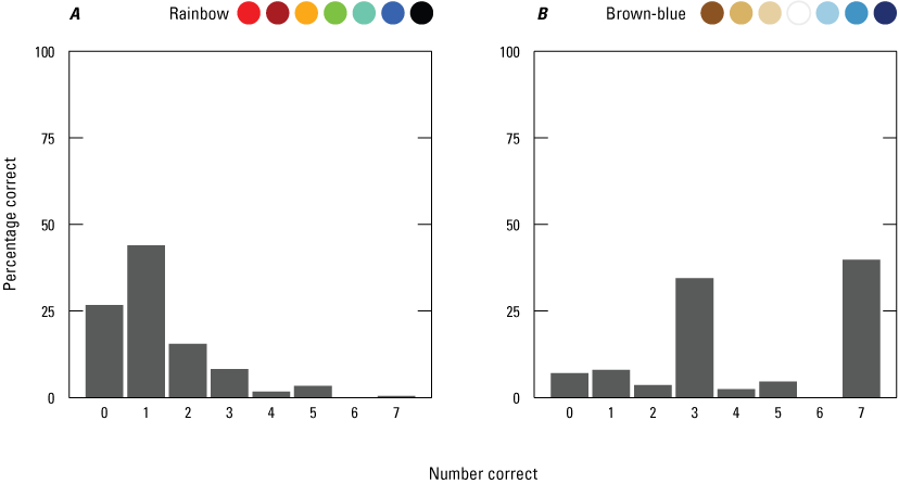
Graphs showing the percentage of 412 respondents for Survey 1 who correctly ranked each color for (A) the rainbow colormap (fig. 2) and (B) the brown-blue colormap (fig. 3). Rainbow and brown-blue colormaps are shown above the graphs for reference to streamflow anomaly maps in figures 2 and 3, respectively.
For the rainbow colormap, much of the confusion came from the placement of black and green (fig. 5). Sixty-four percent of respondents incorrectly ranked black as representing the least streamflow, while only 17 percent correctly ranked black as representing the most streamflow. Green was most identified as a higher-than-normal streamflow color, as opposed to normal streamflow. In its place, orange was the most frequently chosen color for normal streamflow. For the brown-blue colormap (fig. 5), 47 percent of respondents correctly ranked white as representing normal streamflow, whereas 39 percent incorrectly ranked white as representing the least streamflow.
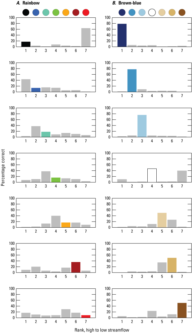
Graphs showing the percentage of 412 respondents for Survey 1 who ranked streamflow anomaly percentiles for each color for (A) the rainbow colormap (fig. 2) and (B) the brown-blue colormap (fig. 3). The ranking results are shown for each color from highest streamflow percentile class (top; black or dark blue circle) to lowest streamflow percentile class (bottom; bright red or brown circle), and the rank position is indicated by the numbers 1–7 shown along the x-axis from left to right, where 1 is the highest streamflow percentile class and 7 is the lowest streamflow percentile class. In each graph, the colored bar indicates the correct rank position and the percentage of respondents who correctly ranked that color. Incorrect rankings and the percentage of respondents who incorrectly ranked a given color at that rank position are shown by gray bars for all incorrect rank positions. For example, in the upper left graph, fewer than 20 percent of respondents correctly ranked black as the highest streamflow percentile class (rank 1), while more than 60 percent incorrectly ranked it as the lowest percentile class (rank 7).
Survey 2 did not include the colormap ranking questions. Instead, it showed respondents the map legend with colors and streamflow-level labels (for example, normal, above normal, much above normal) and asked them to pick the colors that matched to low, normal, and high. For both colormaps, about 93 percent of respondents were able to identify the correct colors. This result indicates that while the brown-blue colormap more intuitively represented streamflow anomalies, differences in intuition about colormapping did not necessarily affect the ability to read the streamflow anomaly legend.
Effect on Understandability of Changing Colormaps—Research Question 2
The results related to Research Question 2 (Does switching from the rainbow colormap to a brown-blue colormap affect the understandability of WaterWatch maps?) indicated that brown-blue colormaps resulted in higher respondent performance in identifying thresholds between percentile classes. For the original rainbow colormap, respondent performance in Survey 1 varied across tasks (fig. 6), with the higher-than-normal cluster identification task being most understood (79 percent) and the above-normal-transition-to-normal task being least understood (51 percent). The effect of replacing the rainbow colormap with the brown-blue colormap also varied across tasks. All tasks showed some improvement, with the largest improvements in the higher-than-normal cluster and above-normal-to-normal cluster transition tasks: odds increased by a factor of 1.61 (with a confidence interval [CI]=1.22–2.13 percent and an attained significance level [p value]<0.001) and a factor of 1.31 (CI=1.10–1.56 percent and p value=0.002), respectively (table 1). The increases in correct response rate due to the use of the blue-brown colormap indicated that using black as the highest percentile and a normal-to-above-normal transition of green to turquoise causes significant confusion.

Graph showing the percentage of respondents who correctly completed each task (high, low, above normal, and below normal) for each design. For the four tasks, “high” refers to the high-percentile gage cluster identification task; “low” refers to the low-percentile gage cluster identification task; “above normal” refers to the transition from above-normal- to normal-percentile gages cluster identification task; and “below normal” refers to the transition from below-normal- to normal-percentile gages cluster identification task. For the four bars for each task, “no legend, rainbow” and “no legend, brown-blue” indicate that respondents did not see a preparatory question related to the legend, whereas “legend, rainbow” and “legend, brown-blue” indicate that respondents did see a preparatory question. The terms “rainbow” and” brown-blue” refer to the control (fig. 2) and treatment (fig. 3) colormaps. The control case is the rainbow colormap without preparatory questions related to the legend. Sample sizes are 412 and 437 respondents for “no legend” and “legend” tasks, respectively.
Table 1.
Logistic regression model results for map understandability, measured as whether a respondent correctly completed the task in a survey questionnaire. There were no significant results with p value <0.1 and ≥0.05.[“Colormap” and “Survey” are binary variables indicating the effect of colormap treatment and priming the respondent with a preparatory question related to a legend. Regression coefficients are shown as odds ratios with 95 percent confidence intervals in parentheses. Sample sizes are 412 and 437 respondents for Surveys 1 and 2, respectively. “Above-normal” refers to the transition from above-normal- to normal-percentile gages cluster identification task; and “below-normal” refers to the transition from below-normal- to normal-percentile gages cluster identification task. Terms: ‡ p value <0.1,* p value<0.05,** p value<0.01, *** p value<0.001; if no asterisk or dagger appears, the p value was ≥0.1]
Effect on Understandability of Priming With a Legend—Research Question 3
The results related to Research Question 3 (Is understandability enhanced by introducing users to the colormap legend?) provided information about the usefulness of introducing respondents to map legends before requiring tasks. Survey 2 had the same search-and-click tasks as Survey 1, and in addition, it primed respondents with questions about the legend used for each colormap. For the original rainbow colormap, adding questions about the legend in Survey 2 did not change the tasks’ ranking in terms of understandability: the high-percentile cluster task was most understood, and the above-normal transition task was least understood. Also similar to Survey 1, all tasks showed some improvement from replacing the rainbow colormap (table 1). The largest improvements were in the high-percentile cluster and above-normal-percentile transition tasks: odds increased by a factor of 1.33 (CI=1.01–1.75, p value=0.04) and 1.42 (CI=1.21–1.68, p value<0.001), respectively.
Examination of the pooled model ANOVA results for the comparison of Surveys 1 and 2 showed that none of the interaction terms were significant (table 2). The ANOVA results also showed that for the low-percentile cluster test, priming with the legend had a significant effect on understandability (Wald’s [1943] chi-square test statistic [chi-sq]=8.58, p value=0.004), whereas changing the colormap in either survey had a minimal effect.
Table 2.
Results of Type II ANOVA (analysis of variance test) based on Wald’s chi-square test statistics for the pooled survey model.[Data on the pooled survey model are in table 1. Wald’s (1943) chi-square test statistics (degrees of freedom, df=1) are shown in this table. “Above-normal” refers to the transition from above-normal- to normal-percentile gages cluster identification task; and “below-normal” refers to the transition from below-normal- to normal-percentile gages cluster identification task. There were no significant results with p value <0.1 and ≥0.05. Terms: ‡ p value<0.1, * p value<0.05, ** p value<0.01, *** p value<0.001; if no asterisk or dagger appears, the p value was ≥0.1]
Effect on Efficiency of Changing Colormaps—Research Question 4
Results related to Research Question 4 (Does switching from the rainbow colormap to a brown-blue colormap affect the efficiency of WaterWatch maps?) showed that the most efficiency was gained for the task of identifying above-normal streamflow conditions. Sample sizes (numbers of respondents) for these results include the following: high/no legend=305, high/legend=333, low/no legend=207, low/legend=253, above/no legend=179, above/legend=201, below/no=91, and below/yes=212. Variations in sample size occurred because only respondents who completed both colormaps of a task correctly were included. For the original rainbow colormap, respondent efficiency in Survey 1 varied across tasks (fig. 7), with the high-percentile cluster identification task taking the least time (20.5 seconds [s]) and the above-normal to normal cluster transition task without legend priming taking the most time (28.3 s). This variation in efficiency is notable because the high and above-normal transition tasks were the most and least understood, implying that increases in understanding are correlated with increases in efficiency. The effect of replacing the rainbow colormap with the brown-blue colormap also varied across tasks. The above-normal to normal cluster transition task showed the largest improvement, with a reduction in time of 5.3 s, while the high-percentile cluster and low-percentile cluster tasks’ reductions in time were marginal and not significant (table 3). The increase in efficiency due to the use of the brown-blue colormap in the above-normal task indicates that the transition between light blue and white was more discernable than the transition between turquoise and green.

Graph showing the geometric mean of completion time for each task only for respondents who correctly answered both the control and treatment colormap tasks. “High” refers to the high-percentile gage cluster identification task; “low” refers to the low-percentile gage cluster identification task; “above-normal” refers to the transition from above-normal- to normal-percentile gages cluster identification task; and “below-normal” refers to the transition from below-normal- to normal-percentile gages cluster identification task.
Table 3.
Linear regression model results for efficiency, measured as the log of time to complete a task only for respondents who completed it correctly.[“Colormap” and “Survey” are binary variables indicating the effect of colormap treatment and priming with a legend that was tested between Surveys 1 and 2. Regression coefficients are shown with standard errors adjusted for participant clustering (in parentheses). Baseline comparison is against the original rainbow colormap visualization without respondents being given a preparatory question about legends. “Above normal” refers to the transition from above-normal- to normal-percentile gages cluster identification task; and “below normal” refers to the transition from below-normal- to normal-percentile gages cluster identification task. Terms: ‡ p value<0.1, * p value<0.05, ** p value<0.01, *** p value<0.001; if no asterisk or dagger appears, the p value was ≥0.1]
Effect on Efficiency of Priming With a Legend—Research Question 5
Results related to Research Question 5 (Is efficiency enhanced by introducing users to the colormap legend?) indicated that legend priming in Survey 2 decreased response time in three out of four tasks—all tasks except the above-normal tasks. For the original rainbow colormap, adding questions about the legend in Survey 2 (legend priming) did not change the tasks’ ranking in terms of understandability: the high-percentile cluster identification task was completed most quickly (17.9 s), and the above-normal transition task took the most time (25.8 s). In contrast to the improvements on understandability, the legend’s improvements on efficiency were more pronounced across tasks (table 4), with the exception of the above-normal transition task. For the above-normal transition task, the effect of changing the colormap was significant (F=14.2, p value<0.001), while the effect of priming with the legend was not (F=2.24, p value=0.14). The average marginal effect of replacing the colormap is a decrease in completion time of 18.6 percent (p value<0.001).
Table 4.
Results of Type II ANOVA (analysis of variance) based on F-test statistics for the pooled survey model.[Data on the pooled survey model are in table 1. Variances between samples were compared with the F-test statistics shown in this table 4. “Above normal” refers to the transition from above-normal- to normal-percentile gages cluster identification task; and “below normal” refers to the transition from below-normal- to normal-percentile gages cluster identification task. Terms: ‡ p value<0.1, * p value< 0.05, ** p value< 0.01, *** p value <0.001; if no asterisk or dagger appears, the p value was ≥0.1]
For the high-percentile cluster identification task, the colormap had no effects on either surveys (F=0.0003, p value=0.98), but priming with a legend had a significant effect (F=10.7, p value=0.0012). The average marginal effect of priming with a legend yielded a decrease in completion time of 11.1 percent (p value=0.005). In contrast, for the low-percentile cluster identification task, both replacing the rainbow colormap (F=0.410, p value=0.52) and priming with a legend (F=5.12, p value=0.03) improved efficiency. The average marginal effect of priming with a legend yielded a decrease in completion time of 9.8 percent (p value=0.02), and within Survey 2 with legend priming, the brown-blue colormap reduced completion time compared to the rainbow colormap by 2.8 percent (p value=0.05). Similarly, for the below-normal transition task, both replacing the rainbow colormap (F=0.154, p value=0.7) and priming with a legend (F=10.9, p value<0.001) affected efficiency, but only priming with a legend led to improvements. The average marginal effect of priming with a legend decreased completion time by 16.2 percent (p value< 0.001), while with Survey 2, the brown-blue colormap increased completion compared to the rainbow colormap by 1.9 percent (p value=0.03).
User Preferences—Research Question 6
Results related to Research Question 6 (Do user preferences for the rainbow colormap or a brown-blue colormap align with objective measures of performance?) indicated that with or without legend priming, respondents had a strong subjective preference for the rainbow colormap. In Survey 1, where respondents were not primed with the legend, respondents indicated that the rainbow colormap was better at identifying extremes, more appealing, a better signal of wetter versus drier, and preferred for a graphic on the landing page of a website (fig. 8). For identifying normal streamflow and for overall trust, respondents indicated that they prefer the colormaps about the same. The brown-blue colormap was identified as best for none of the subjective outcomes. When compared to Survey 2 (849 respondents across two surveys), the distributions mostly remained the same, with the exception of overall appeal (p value=0.06) and signaling wetter versus drier (p value<0.001). In particular, priming with a legend led to an increase in the number of respondents who thought the colormaps were equally good at signaling wetter versus drier (p value<0.001) and a decrease in the number of respondents who thought the brown-blue colormap was better at signaling wetter versus drier (p value=0.001).

Graphs showing Survey 2 respondent preferences for using the rainbow colormap or the brown-blue colormap for six purposes. The purposes are identifying extremes in streamflow (“Extremes”), identifying normal streamflow (“Normal”), having an appealing appearance (“Appealing”), signaling wetter versus drier conditions (“Signal”), being trustworthy (“Trust”), and being appropriate for a landing web page (“Prefer”). Sample size: 849 respondents.
Discussion
In this report, we present a case study in applying user-centered design to a legacy geovisualization product, the USGS WaterWatch. Using expert interviews and a diagnostic typology, we identified a major potential visual challenge for users—the colormap—and then tested the efficacy of a targeted redesign. Our driving research questions follow:
-
• RQ1: Do users have preconceived beliefs about how colors map to streamflow levels?
-
• RQ2: Does switching from the rainbow colormap to a brown-blue colormap affect the understandability of WaterWatch maps?
-
• RQ3: Is understandability enhanced by introducing users to the colormap legend?
-
• RQ4: Does switching from the rainbow colormap to a brown-blue colormap affect the efficiency of WaterWatch maps?
-
• RQ5: Is efficiency enhanced by introducing users to the colormap legend?
-
• RQ6: Do user preferences for the rainbow colormap or a brown-blue colormap align with objective measures of performance?
Overall, aside from evaluation of preference, test metrics showed that the brown-blue colormap outperforms the rainbow colormap, corroborating previous findings on using the rainbow colormap for diverging schemes (Borkin and others, 2011). The results for RQ1 demonstrated that very few respondents have an intuitive sense for how the rainbow colormap should be ordered. With both colormaps, the least-intuitive interpretation was for the “neutral” colors—black for the rainbow colormap and white for the brown-blue colormaps. Black was more likely to be seen as the “driest” color, leading blue to be most frequently and incorrectly identified as being associated with the highest streamflow in the rainbow colormap. Likewise, white is a neutral color that was incorrectly ranked by 39 percent of respondents as the lowest streamflow in the brown-blue colormap. The results indicate that neutral colors are often chosen to represent normal conditions in divergent colormaps. Therefore, when only neutral colors are used to create a colormap, users may misidentify the values the colors represent.
For understandability (RQ2 and RQ3), the pooled results across both surveys show that changing the colormap had significant effects for the high-percentile cluster and above-normal-to-normal-percentile cluster transition tasks. These effects on the transition tasks may be expected because distinguishing black from navy and turquoise from green can be the most difficult comparisons in the rainbow colormap because of the lack of contrast between the colors. The pooled results also show that priming with a legend (RQ3) had a positive effect on understandability for the lower-than-normal-to-normal-percentile cluster task. With respect to the difference in contrast between maroon and red, the ordering of the colors in the rainbow colormap, with red being more severe, may not be intuitive. Thus, reminding participants of the colors’ ordering with a legend increased understandability.
Compared to understandability, priming with a legend had a stronger effect on efficiency (RQ4 and RQ5), with improvements in the total time to completion seen for the high- and low-percentile cluster and the below-normal-percentile cluster transition tasks. For the above-normal-percentile cluster task, switching from comparing turquoise to green to comparing light blue to white dominated any improvements observed from priming with a legend—more evidence that the blue-brown divergent colormap outperforms the rainbow colormap in this context.
For the below-normal-percentile cluster transition task, changing the colormap to brown-blue seemed to have little effect on understandability and actually worsened efficiency. This lack of change in understandability might partly be explained by the two colormaps: comparing green to orange may be of equivalent difficulty to comparing white to light brown. However, this difficulty would not explain the decrease in efficiency. One hypothesis is that the monochromatic brown sequence in the brown-blue colormap may be harder to distinguish than the orange, maroon, and red sequence of the rainbow colormap, leading to extra time needed to differentiate light brown from brown and dark brown. If so, then it is helpful to make sure enough contrast is present to easily distinguish gradations within a category. This may be especially important when extremes in gradient may need to be clearly distinguished. Because distinguishing across categories is important for correct interpretation, the number of percentile classes chosen may affect both efficiency and understanding. It was beyond the scope of this work to investigate variation in the count of percentile classes, but this topic may improve the understanding of the survey results presented here.
The results for RQ6, which show a strong subjective preference for the rainbow colormap, corroborate previous studies that show users’ subjective responses might not match their performance (Dasgupta and others, 2020). While it may be faster and more cost-effective to simply ask users how much they like or otherwise feel about competing designs, following subjective feedback when seeking to improve performance may lead to a less understandable and efficient design. Thus, it is important to obtain both objective and subjective measures when designing changes, especially for legacy products, where users may have an affinity for the status quo.
Previous work on diverging rainbow colormaps relied on responses from expert users (Borkin and others, 2011), whereas the work described in this report relied on responses from members of the general public. Our corroborating result that rainbow colormaps performed worse than brown-blue divergent colormaps indicates that the general public may be used as a proxy for expert users. This result is encouraging because it may be more cost-effective to enroll large numbers of non-expert users through online surveys than to make contact with and enroll expert users.
Major visualization changes to high-profile products can be effectively designed to engage users. Our work highlights how user-centered design can be utilized to both improve the usability of high-profile legacy decision-support tools that are accessible to a wide range of users and to contribute to the visualization literature. In this case, we provide positive evidence for modifying a familiar feature of a legacy environmental decision-support tool and contribute to a growing body of work on the use of colormaps. As the application of environmental decision-support tools grows, continuing opportunities for broader implementation of evidence-based approaches to certain design changes can improve data product design and usability.
References Cited
Adikari, S., McDonald, C., and Campbell, J., 2009, Little design up-front—A design science approach to integrating usability into agile requirements engineering, in Jacko, J.A., ed., Human-Computer Interaction—New Trends, 13th International Conference, HCI International 2009, San Diego, Calif., Proceedings, part 1: Lecture Notes in Computer Science, v. 5610, p. 549–558, accessed June 2022, at https://doi.org/10.1007/978-3-642-02574-7_62.
Borkin, M., Gajos, K., Peters, A., Mitsouras, D., Melchionna, S., Rybicki, F., Feldman, C., and Pfister, H., 2011, Evaluation of artery visualizations for heart disease diagnosis: IEEE Transactions on Visualization and Computer Graphics, v. 17, no. 12, p. 2479–2488, accessed June 2022, at https://doi.org/10.1109/TVCG.2011.192.
Brhel, M., Meth, H., Maedche, A., and Werder, K., 2015, Exploring principles of user-centered agile software development—A literature review: Information and Software Technology, v. 61, p. 163–181, accessed June 2022, at https://doi.org/10.1016/j.infsof.2015.01.004.
Çöltekin, A., Bleisch, S., Andrienko, G., and Dykes, J., 2017, Persistent challenges in geovisualization—A community perspective: International Journal of Cartography, v. 3, no. sup1, p. 115–139, accessed June 2022, at https://doi.org/10.1080/23729333.2017.1302910.
Crameri, F., Shephard, G.E., and Heron, P.J., 2020, The misuse of colour in science communication: Nature Communications, v. 11, no. 1, article 5444, 10 p., accessed June 2022, at https://doi.org/10.1038/s41467-020-19160-7.
Dasgupta, A., Poco, J., Rogowitz, B., Han, K., Bertini, E., and Silva, C.T., 2020, The effect of color scales on climate scientists’ objective and subjective performance in spatial data analysis tasks: IEEE Transactions on Visualization and Computer Graphics, v. 26, no. 3, p. 1577–1591, accessed June 2022, at https://doi.org/10.1109/TVCG.2018.2876539.
Dasgupta, A., Poco, J., Wei, Y., Cook, R., Bertini, E., and Silva, C.T., 2015, Bridging theory with practice—An exploratory study of visualization use and design for climate model comparison: IEEE Transactions on Visualization and Computer Graphics, v. 21, no. 9, p. 996–1014, accessed June 2022, at https://doi.org/10.1109/TVCG.2015.2413774.
Gerst, M.D., Kenney, M.A., Baer, A.E., Speciale, A., Wolfinger, J.F., Gottschalck, J., Handel, S., Rosencrans, M., and Dewitt, D., 2020, Using visualization science to improve expert and public understanding of probabilistic temperature and precipitation outlooks: Weather, Climate, and Society, v. 12, no. 1, p. 117–133, accessed June 2022, at https://doi.org/10.1175/WCAS-D-18-0094.1.
Gerst, M.D., Kenney, M.A., and Feygina, I., 2021, Improving the usability of climate indicator visualizations through diagnostic design principles: Climatic Change, v. 166, nos. 3–4, article 33, 22 p., accessed June 2022, at https://doi.org/10.1007/s10584-021-03109-w.
Gerst, M., Kenney, M., and Read, E., 2025, Using visualization science to inform redesigning environmental decision support tools—A case study of the USGS WaterWatch: Figshare dataset, accessed April 2025, at https://doi.org/10.6084/m9.figshare.20523906.v3.
Grainger, S., Mao, F., and Buytaert, W., 2016, Environmental data visualisation for non‑scientific contexts—Literature review and design framework: Environmental Modelling & Software, v. 85, p. 299–318, accessed June 2022, at https://doi.org/10.1016/j.envsoft.2016.09.004.
Harold, J., Lorenzoni, I., Shipley, T.F., and Coventry, K.R., 2016, Cognitive and psychological science insights to improve climate change data visualization: Nature Climate Change, v. 6, no. 12, p. 1080–1089, accessed June 2022, at https://doi.org/10.1038/nclimate3162.
Jian, X., Wolock, D., and Lins, H.F., 2008, WaterWatch—Maps, graphs, and tables of current, recent, and past streamflow conditions: U.S. Geological Survey Fact Sheet 2008–3031, 2 p. [Also available at https://doi.org/10.3133/fs20083031.]
Kelleher, C., and Braswell, A., 2021, Introductory overview—Recommendations for approaching scientific visualization with large environmental datasets: Environmental Modelling & Software, v. 143, article 105113, 18 p., accessed June 2022, at https://doi.org/10.1016/j.envsoft.2021.105113.
Kenney, M.A., Gerst, M.D., and Read, E., 2024, The usability gap in water resources open data and actionable science initiatives: Journal of the American Water Resources Association, v. 60, no. 1, p. 1–8, accessed August 2024, at https://doi.org/10.1111/1752-1688.13153.
Leeper, T.J., 2024, margins—Marginal effects for model objects: R package version 0.3.28, accessed July 2024, at https://cran.r-project.org/web/packages/margins/margins.pdf.
McIntosh, B.S., Ascough, J.C., II, Twery, M., Chew, J., Elmahdi, A., Haase, D., Harou, J.J., Hepting, D., Cuddy, S., Jakeman, A.J., Chen, S., Kassahun, A., Lautenbach, S., Matthews, K., Merritt, W., Quinn, N.W.T., Rodriguez-Roda, I., Sieber, S., Stavenga, M., Sulis, A., Ticehurst, J., Volk, M., Wrobel, M., van Delden, H., El-Sawah, S., Rizzoli, A., and Voinov, A., 2011, Environmental decision support systems (EDSS) development—Challenges and best practices: Environmental Modelling & Software, v. 26, no. 12, p. 1389–1402, accessed June 2022, at https://doi.org/10.1016/j.envsoft.2011.09.009.
Quinan, P.S., Padilla, L.M., Creem-Regehr, S.H., and Meyer, M., 2019, Examining implicit discretization in spectral schemes: Computer Graphics Forum, v. 38, no. 3, p. 363–374, https://doi.org/10.1111/cgf.13695.
R Core Team, 2024, R—A language and environment for statistical computing, version 4.4.0: R Foundation for Statistical Computing software release, accessed August 2025, at https://www.R-project.org.
Ramachandran, R., Bugbee, K., and Murphy, K., 2021, From open data to open science: Earth and Space Science, v. 8, no. 5, article e2020EA001562, 17 p., accessed June 2022, at https://doi.org/10.1029/2020EA001562.
Reda, K., and Szafir, D.A., 2021, Rainbows revisited—Modeling effective colormap design for graphical inference: IEEE Transactions on Visualization and Computer Graphics, v. 27, no. 2, p. 1032–1042, accessed June 2022, at https://doi.org/10.1109/TVCG.2020.3030439.
Stoelzle, M., and Stein, L., 2021, Rainbow color map distorts and misleads research in hydrology—Guidance for better visualizations and science communication: Hydrology and Earth System Sciences, v. 25, no. 8, p. 4549–4565, accessed June 2022, at https://doi.org/10.5194/hess-25-4549-2021.
Terrado, M., Calvo, L., and Christel, I., 2022, Towards more effective visualisations in climate services—Good practices and recommendations: Climatic Change, v. 172, nos. 1–2, article 18, 26 p., accessed June 2022, at https://doi.org/10.1007/s10584-022-03365-4.
Wald, A., 1943, Tests of statistical hypotheses concerning several parameters when the number of observations is large: Transactions of the American Mathematical Society, v. 54, no. 3, p. 426–482, accessed March 14, 2025, at https://doi.org/10.1090/S0002-9947-1943-0012401-3.
Zeileis, A., Köll, S., and Graham, N., 2020, Various versatile variances—An object-oriented implementation of clustered covariances in R: Journal of Statistical Software, v. 95, no. 1, p. 1–36, accessed June 2022, at https://doi.org/10.18637/jss.v095.i01.
Zeller, S., and Rogers, D., 2020, Visualizing science—How color determines what we see: Eos, v. 101, accessed June 2022, at https://doi.org/10.1029/2020EO144330.
Zulkafli, Z., Perez, K., Vitolo, C., Buytaert, W., Karpouzoglou, T., Dewulf, A., De Bièvre, B., Clark, J., Hannah, D.M., and Shaheed, S., 2017, User-driven design of decision support systems for polycentric environmental resources management: Environmental Modelling & Software, v. 88, p. 58–73, accessed June 2022, at https://doi.org/10.1016/j.envsoft.2016.10.012.
Disclaimers
Any use of trade, firm, or product names is for descriptive purposes only and does not imply endorsement by the U.S. Government.
Although this information product, for the most part, is in the public domain, it also may contain copyrighted materials as noted in the text. Permission to reproduce copyrighted items must be secured from the copyright owner.
Suggested Citation
Gerst, M.D., Kenney, M.A., and Read, E., 2025, Using visualization science to inform the design of environmental decision-support tools—A case study of the U.S. Geological Survey Waterwatch: U.S. Geological Survey Scientific Investigations Report 2025–5085, 17 p., https://doi.org/10.3133/sir20255085.
ISSN: 2328-0328 (online)
Study Area
| Publication type | Report |
|---|---|
| Publication Subtype | USGS Numbered Series |
| Title | Using visualization science to inform the design of environmental decision-support tools—A case study of the U.S. Geological Survey Waterwatch |
| Series title | Scientific Investigations Report |
| Series number | 2025-5085 |
| DOI | 10.3133/sir20255085 |
| Publication Date | December 23, 2025 |
| Year Published | 2025 |
| Language | English |
| Publisher | U.S. Geological Survey |
| Publisher location | Reston, VA |
| Contributing office(s) | WMA - Integrated Information Dissemination Division |
| Description | vi, 17 p. |
| Country | United States |
| Online Only (Y/N) | Y |
| Additional Online Files (Y/N) | N |