USGS Open-File Report 2005-1231
The classes that resulted from the classification of the gamma-ray data were individually intersected with the grids of potassium, uranium, and thorium to extract concentration values for the grid cells assigned to each class. Statistical graphs of the concentrations provide information about the data that can be interpreted in terms of the uniformity and robustness of a class. The figure below shows pairs of graphs of the concentrations of potassium, uranium, and thorium corresponding to grid cells identified as class R01. In each pair of graphs, the left graph is a histogram and the right graph is a normal probability plot. Please refer to the glossary for more information about each type of graph. The interpretation of these types of graphs is discussed below and the table of contents provides access to the graphs for each of the classes.
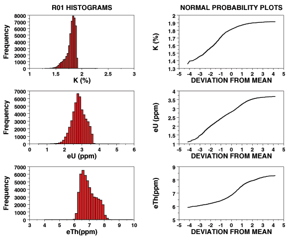
Histograms and normal probability graphs of potassium, uranium, and thorium concentrations for class R01.
The histograms (graphs on the left above) are plots of the number of data that have values within narrow ranges of concentrations. The shape of the histograms can be used to judge whether the distributions of the data are simple or complex. Symmetric distributions with decreasing numbers on either side of a peak value indicate a simple distribution that can be represented as a normal distribution. Asymmetric distributions indicate skewed distributions and multiple peaks indicate that the classification may have some problems. For class R01, the histogram of the potassium concentrations is asymmetric with truncation at values near 2.0. The histogram of the uranium concentrations is also asymmetric with some truncation at values near 3.6. The histogram of the thorium concentrations is asymmetric with some truncation at values near 8.0. The thorium histogram appears to be somewhat bimodal.
The normal probability graphs (graphs on the right above) plot the data ordered from smallest to largest values versus the value minus the mean value and then normalized to the standard deviation. A straight line on such a graph indicates that the distribution is a uniform normal distribution. A curved line indicates that the data do not fit a normal distribution. For class R01, the normal probability plots indicate that the distributions cannot be well represented by normal distributions.
The fact that the distributions are skewed is not necessarily an indication that the class is not robust. The evidence of bimodal characteristics does indicate that some of the grid cells are not properly classified. One needs to examine the geometric characteristics of the class for additional evidence (refer to the classification map). Class R01 has many relatively small areas of contiguous grid cells but most of them occur in areas mapped as units of the Beaumont Formation (refer to the geologic map). The fact that some of the areas occur within areas mapped as other geologic units suggests that class R01 is not strongly robust although the association with the Beaumont Formation does indicate that it is reasonably robust.
R01 | R02 | R03 | R04 | R05 | R06 | R07 | R08 | R09 | R10 | R11 | R12 | R13 | R14 | R15 | R16 | R17 | R18 | R19 | R20 | R21
![]() Conclusions | Histogram Comparisons
Conclusions | Histogram Comparisons ![]()

![]() U.S. Department of the Interior |
U.S. Geological Survey
U.S. Department of the Interior |
U.S. Geological Survey
URL: http://pubsdata.usgs.gov/pubs/of/2005/1231/sumstat.htm
Page Contact Information: Stephen Snyder
Page Last Modified: Saturday, 12-Jan-2013 21:28:29 EST