NOTE: Click on the following thumbnails to view a larger .jpg image. Right click on the links below the image to download or "save as" either .jpg or .pdf versions of the figures.
Download all figures (.jpg format) as a single compressed .zip file
Download all figures (.pdf format) as a single compressed .zip file
Download metadata files (.txt format) for all figures as a single compressed .zip file |

Figure 1.jpg
Figure 1.pdf |
Figure 1. Index map of Newberry Volcano,
modified from Donnelly-Nolan and others, 2011. The yellow
outline represents the full apron of lavas erupted during the
volcano’s lifetime. It covers approximately 3,000 square
kilometers (1,200 square miles), making this the largest
volcano in the Cascades chain. Light green represents lavas
erupted in the most recent 75,000 years. The stars represent
post-glacial eruptive centers. Dark yellow represents
post-glacial but pre-Mazama (7,700 years before present, yr
B.P.) eruptive products; light red represents post-Mazama
(most recent) flows. The dark blue outline is the Newberry
National Volcanic Monument. The volcanic edifice itself
occupies a much smaller area in the immediate vicinity of
Newberry Caldera. Figure adapted from Donnelly-Nolan and
others (2011). |

Figure 2.jpg
Figure 2.pdf |
Figure 2. Map of color-shaded regional topography
provided here for reference, derived from Shuttle Radar
Topography Mission 30 (SRTM-30) digital
elevation data. The thick black line represents the maximum
extent of lava flows associated with Newberry Volcano,
equivalent to the yellow outline in figure 1. Roads and select
reference points, such as cities and nearby volcanic features,
are also superimposed for reference. Broad geologic terranes
and some specific features referred to in the text are
labeled. (m, meters.) Figure 2 metadata. |

Figure 3.jpg
Figure 3.pdf |
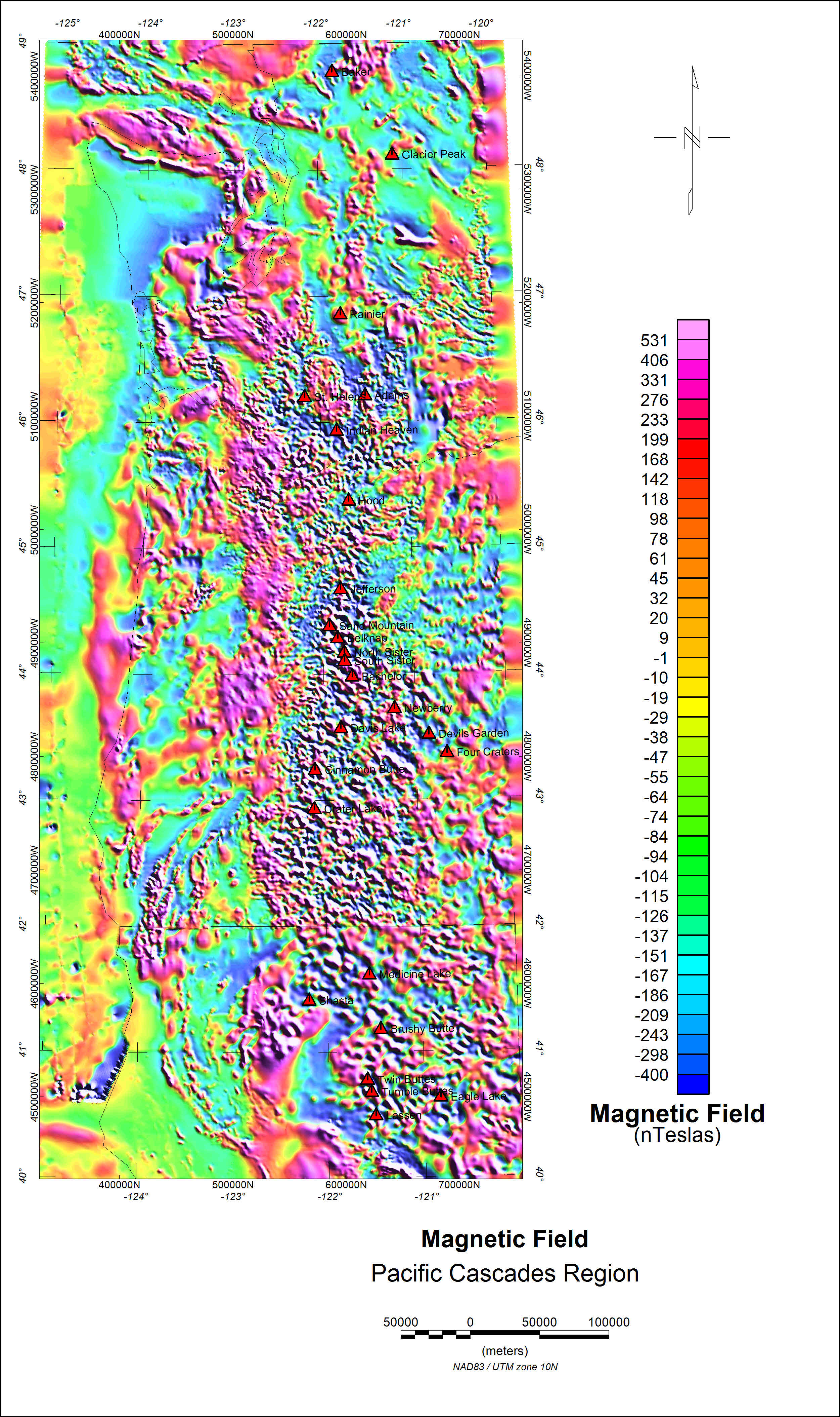
Figure 3. Map of regional
magnetic field
data for the U.S. Pacific Northwest. Different wavelengths are
clearly visible at the California-Oregon border transition,
caused by aeromagnetic surveys with different flight-line
spacings. Volcanoes are shown as triangles. (nT,
nanoteslas.) Figure 3 metadata. |

Figure 4.jpg
Figure 4.pdf |
Figure 4. Map of complete Bouguer gravity anomaly (CBA) map for the
U.S. Pacific Northwest. Occasional white gaps are caused by
gravity station separations greater than 12 kilometers and
generally represent rugged terrain. Volcanoes are shown as
triangles. (Gravity anomaly reduced for a density of 2.67
grams per cubic centimeter (g/cc), in milliGals
(mGal).) Figure 4 metadata. |

Figure 5.jpg
Figure 5.pdf |
Figure 5. Map of magnetic data for central Oregon, superimposed
over shaded-relief topography. The thick black outline depicts
the maximum extent of lava flows associated with Newberry
Volcano, equivalent to the yellow outline in figure 1. Paulina
Peak represents the high point on the south rim of Newberry
Volcano’s caldera; roads and select landmarks are shown to
orient the reader. The southern boundary of this figure is the
California-Oregon border. (nT, nanoteslas.) Figure 5 metadata. |

Figure 6.jpg
Figure 6.pdf |
Figure 6. Map of magnetic data for central Oregon with Centre for
Exploration Targeting (CET) domain boundaries (explained in
the text) superimposed over it. These boundaries separate
discrete magnetic sources, including different flows and
non-volcanic terrains, to a depth of as much as 15 kilometers.
The thick black outline represents the maximum extent of lava
flows associated with Newberry Volcano, equivalent to the
yellow outline in figure 1. The southern boundary of this
figure is the California-Oregon border. (nT,
nanoteslas.) Figure 6 metadata. |

Figure 7.jpg
Figure 7.pdf |
Figure 7. Map of complete Bouguer gravity data for central Oregon,
superimposed over shaded-relief topography. The thick black
outline represents the maximum extent of lava flows associated
with Newberry Volcano, equivalent to the yellow outline in
figure 1. Paulina Peak identifies the actual location of
Newberry’s main edifice. Roads and select landmarks are shown
to orient the reader. Individual gravity station locations are
represented by small plus (+) symbols, and gray areas indicate
either beyond-the-study edges or gaps in the station-density
exceeding 12 kilometers (due to rugged, inaccessible terrain).
The southern boundary of this figure is the California-Oregon
border. (Gravity anomaly reduced for a density of 2.67 grams
per cubic centimeter (g/cc), in milliGals
(mGal).) Figure7 metadata. |

Figure 8.jpg
Figure 8.pdf |
Figure 8. Map of complete Bouguer gravity anomaly (CBA) map for central
Oregon with Centre for Exploration Targeting (CET) domain
boundaries (explained in text) superimposed over it. These
boundaries mark discrete changes in density regimes to a depth
of 50+ kilometers. The thick black outline represents the
maximum extent of lava flows associated with Newberry Volcano,
equivalent to the yellow outline in figure 1. The southern
boundary of this figure is the California-Oregon border.
(Gravity anomaly reduced for a density of 2.67 grams per cubic
centimeter (g/cc), in milliGals (mGal).) Figure 8 metadata. |

Figure 9.jpg
Figure 9.pdf |
Figure 9. Map of the different magnetic datasets available in
the public domain for the near vicinity of Newberry Volcano.
Light green represents discrete aeromagnetic surveys acquired
digitally, mostly since the mid-1980s; two surveys mentioned
by number in the text (Oregon Survey Nos. 3066 and 4108) are
labeled. Purple represents older analog aeromagnetic surveys
for which data were later manually digitized by the U.S.
Geological Survey. White represents the coarsest data, mostly
5- and 10-kilometer (km) spacing aeromagnetic data, acquired
as part of the National Uranium Resource Evaluation (NURE)
surveys of the late 1970s and early 1980s. The thick black
line represents the maximum extent of flows associated with
Newberry Volcano, equivalent to the yellow outline in figure
1. Roads (darker purple lines) are also superimposed for
reference. Figure 9 metadata. |

Figure 10.jpg
Figure 10.pdf |
Figure 10. Map of the local magnetic field around Newberry Volcano,
compiled by merging magnetic data from numerous sources. The
magnetic field strength is represented in color draped over a
contoured, shaded-relief topography. A careful comparison with
figure 9 shows that edge-effects from data-splicing are
apparent. The thick black outline represents the maximum
extent of lava flows associated with Newberry Volcano,
equivalent to the yellow outline in figure 1. (nT,
nanoteslas.) Figure 10 metadata. |

Figure 11.jpg
Figure 11.pdf |
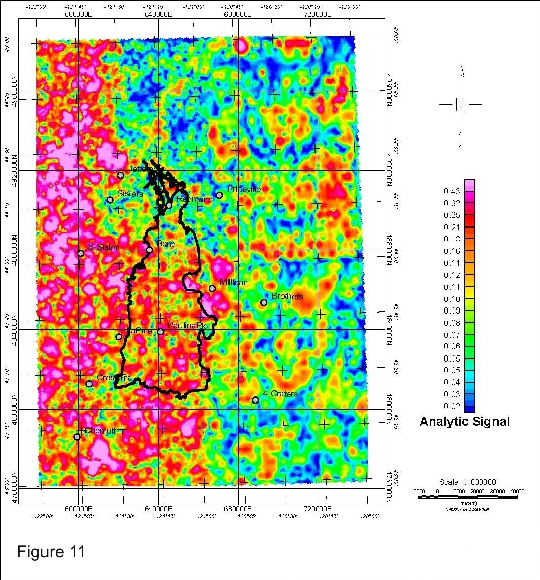
Figure 11. Map of the same local magnetic field data for Newberry
Volcano shown in figure 10 after an analytic signal filter has
been passed over it. Here edge effects are more clearly
obvious in abrupt transitions, for instance at 44° N. and 121°
W. Consequently, it is not possible to use these data for
depth-modeling calculations with any confidence. The thick
black outline represents the maximum extent of lava flows
associated with Newberry Volcano, equivalent to the yellow
outline in figure 1. Figure 11 metadata. |

Figure 12.jpg
Figure 12.pdf |
Figure 12. Map of the local Complete Bouguer gravity anomaly (CBA)
field around Newberry Volcano draped over shaded-relief
topography, which is shown here because it often correlates
with gravity data. The quality (and wavelength-content) of the
gravity data can be visually assessed from the density of
stations; in this image a small plus (+) symbols represents
gravity stations. Roads are not shown in this figure because
they would obscure the gravity stations collected along them.
The thick black outline represents the maximum extent of lava
flows associated with Newberry Volcano, equivalent to the
yellow outline in figure 1. (Gravity anomaly reduced for a
density of 2.67 grams per cubic centimeter (g/cc), in
milliGals (mGal).) Figure 12 metadata. |

Figure 13.jpg
Figure 13.pdf |
Figure 13. Map of apparent potassium content from National Uranium
Resource Evaluation (NURE) radiometric data for the vicinity
of Newberry Volcano. The data in this figure are quite coarse
and flight-line dominated due to the wide flight-line spacing
(see fig. 9). The thick black outline represents the maximum
extent of lava flows associated with Newberry Volcano,
equivalent to the yellow outline in figure 1. Figure 13 metadata. |

Figure 14.jpg
Figure 14.pdf |
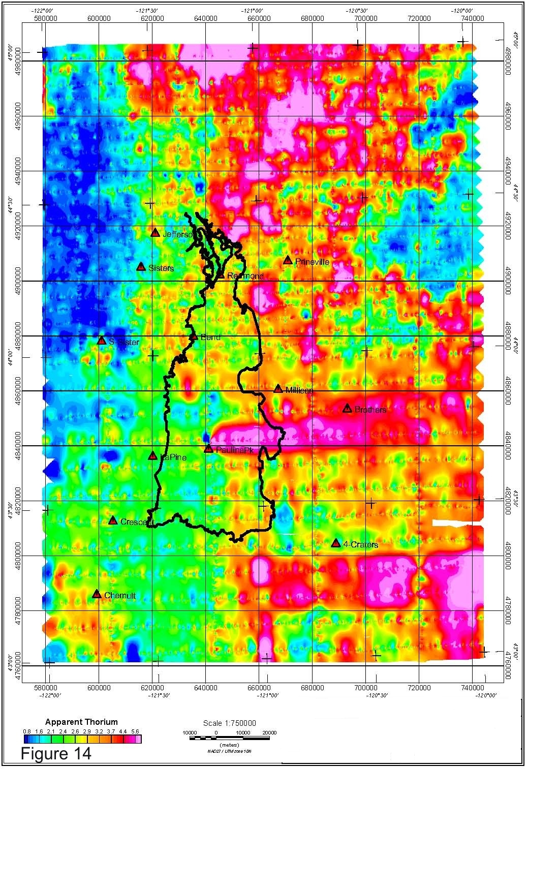
Figure 14. Map of apparent thorium content from National Uranium
Resource Evaluation (NURE) radiometric data for the vicinity
of Newberry Volcano. The data in this figure are quite coarse
and flight-line dominated due to the wide flight-line spacing
(see fig. 9). The thick black outline represents the maximum
extent of lava flows associated with Newberry Volcano,
equivalent to the yellow outline in figure 1. Figure 14 metadata. |

Figure 15.jpg
Figure 15.pdf |
Figure 15. Map of apparent uranium content from National Uranium
Resource Evaluation (NURE) radiometric data for the vicinity
of Newberry Volcano. The data in this figure are quite coarse
and flight-line dominated due to the wide flight-line spacing
(see fig. 9). The thick black outline represents the maximum
extent of lava flows associated with Newberry Volcano,
equivalent to the yellow outline in figure 1. Figure 15 metadata. |

Figure 16.jpg
Figure 16.pdf |
Figure 16. Map of the thorium/potassium ratio from National Uranium
Resource Evaluation (NURE) radiometric data for the vicinity
of Newberry Volcano. The data in this figure are quite coarse
and flight-line dominated due to the wide flight-line spacing
(see fig. 9). The thick black outline represents the maximum
extent of lava flows associated with Newberry Volcano,
equivalent to the yellow outline in figure 1. Figure 16 metadata. |

Figure 17.jpg
Figure 17.pdf |
Figure 17. Map of the uranium/potassium ratio from National Uranium
Resource Evaluation (NURE) radiometric data for the vicinity
of Newberry Volcano. The data in this figure are quite coarse
and flight-line dominated due to the wide flight-line spacing
(see fig. 9). The thick black outline represents the maximum
extent of lava flows associated with Newberry Volcano,
equivalent to the yellow outline in figure 1. Figure 17 metadata. |


