 |
| Click on figures for larger images. |
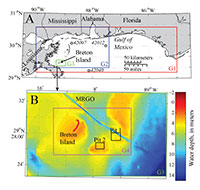 |
Figure 1. Maps showing (A) the location of Breton Island in the Gulf of Mexico, the G1, G2, and G3 numerical model domains, and the three National Data Buoy Center (NDBC) buoys (42040, 42012, and 42007) used in model scenario development and assessment, and (B) the spatial extent of the G3 model domain, showing the G4 domain as well as the extent of two proposed borrow pits considered in the wave modeling study. The channel running northeast of Breton Island is the Mississippi River Gulf Outlet (MRGO). |
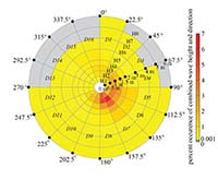 |
Figure 2. Wave bins used to establish the wave climatology at National Data Buoy Center (NDBC) buoy 42040 (fig. 1). A total of 16 wave direction bins (D1D16) and 8 wave height bins (H1H8) were used to discretize the observations. Of the 128 direction and height bins, 12 contained no observations, indicated in gray, leaving 116 model scenarios. For the other wave bins, colors indicate the percentage of observations falling within that bin for the time period December 1995 through December 2013, with values ranging between 0.0016.3 percent. [m, meters] |
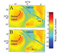 |
Figure 3. Two proposed borrow pit designs evaluated for the impact to the wave climate around Breton Island. [MRGO, Mississippi River Gulf Outlet] |
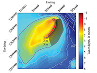 |
Figure 4. Portion of G4 showing the 135 cross-shore transects (in black) used in calculating the alongshore flux. Alongshore flux was calculated using wave height and direction at the most offshore point along each transect where the depth-induced wave breaking dissipation exceeded 0.01 watt per square meter. If this threshold was exceeded offshore of the island platform (defined as the 4 m contour, shown in purple), values at the 4 m contour were used instead. [m, meters] |
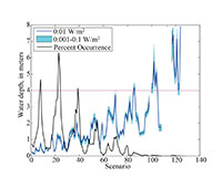 |
Figure 5. Depth at which depth-induced wave breaking dissipation (output from SWAN) exceeded 0.01 watt per square meter (W/m2) (dark blue line) at 95 percent of alongshore locations for each wave scenario. Also shown are the depth at which breaking dissipation exceeded 0.001 W/m2 and 0.1 W/m2 (light blue band) and the percentage occurrence (black line) for each scenario. The island platform was defined as the 4 m contour (in pink; fig. 4), and in cases where the threshold of breaking dissipation was exceeded at deeper than 4 m, values from this depth were used in calculating alongshore flux |
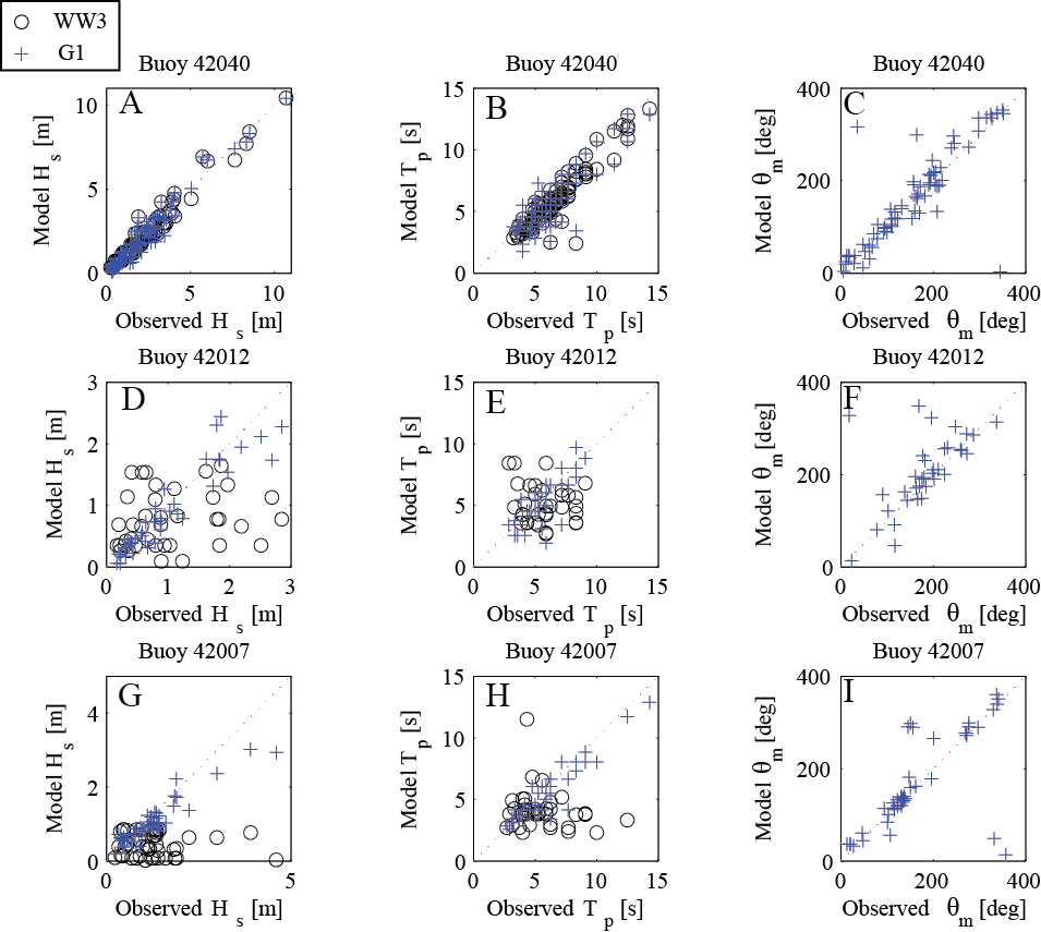 |
Figure 6. Comparison of the Simulating WAves Nearshore (SWAN) grid G1 and WavewatchIII® model output of significant wave height (A,D,G), peak wave period (B,E,H), and mean wave direction (C,F,I) versus observations at National Data Buoy Center (NDBC) buoys 42040, 42012, and 42007. Operational WavewatchIII® does not archive mean direction, so this variable cannot be assessed. G1 has a spatial resolution of approximately 500 m and encompasses the northern Gulf of Mexico. The spatial extent of the grid and location of the buoys used for model assessment are shown in figure 1. [m, meters; s, seconds; deg, degrees] |
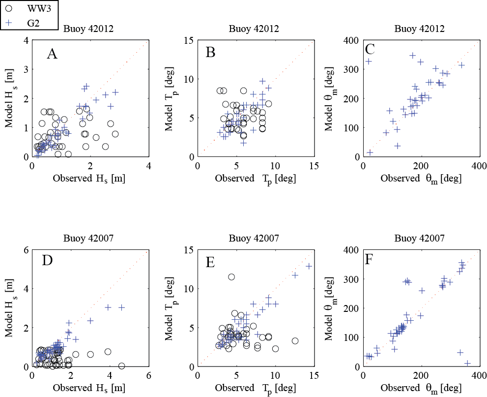 |
Figure 7.Comparison of Simulating WAves Nearshore (SWAN) and WavewatchIII® G2 model output of significant wave height (A,D), peak wave period (B,E), and mean wave direction (C,F) versus observations at National Data Buoy Center (NDBC) buoys 42012 and 42007 for each scenario. Operational WavewatchIII® does not archive mean direction, so this variable cannot be assessed. G2 has a spatial resolution of approximately 300 m and encompasses the western half of the northern Gulf of Mexico. The spatial extent of the grid and location of the buoys used for model assessment are shown in figure 1. [m, meters; deg, degrees] |
 |
Figure 8. Time series above shows a portion (January 1, 2011, through March 31, 2011) of the entire probabilistic wave reconstructed time series (August 24, 2000, to January 31, 2013) at buoy 42012 comparing the observations (black), reconstructed values (red; Long and others, 2014), and measurement at offshore buoy 42040 (blue). [m, meters; s, seconds; deg, degrees] |
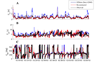 |
Figure 9. Time series above shows a portion (January 1, 2003, through March 31, 2003) of the entire probabilistic wave reconstructed time series (December 4, 1995, to December 30, 2013) at buoy 42007 comparing the observations (black), constructed values (red; Long and others, 2014), and measurement at offshore buoy 42040 (blue). [m, meters; s, seconds; deg, degrees] |
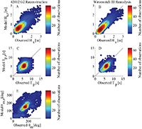 |
Figure 10. Comparison of wave time series constructed using probabilistic method and observations at National Data Buoy Center (NDBC) buoy 42012 for April 2, 2010, to December 30, 2013 (left column), and comparison of the WavewatchIII® dataset and the observations for the same time period (right column). Comparisons of (A, B) significant wave height, (C, D) peak wave period, and (E) mean wave direction. WavewatchIII® output is every 3 hours, whereas Simulating WAves Nearshore (SWAN) results are hourly, resulting in a larger number of points. [m, meters; s, seconds; deg, degrees] |
 |
Figure 11. Comparison of wave time series constructed using probabilistic method and observations at NDBC buoy 42007 for the time period January 19, 2005, to February 15, 2008 (left column), and comparison of the WavewatchIII® dataset and the observations for the same time period (right column). Comparisons of (A, B) significant wave height, (C, D) peak wave period, and (E) mean wave direction. WavewatchIII® output is every 3 hours, whereas Simulating WAves Nearshore (SWAN) results are hourly, resulting in a larger number of points. [m, meters; s, seconds; deg, degrees] |
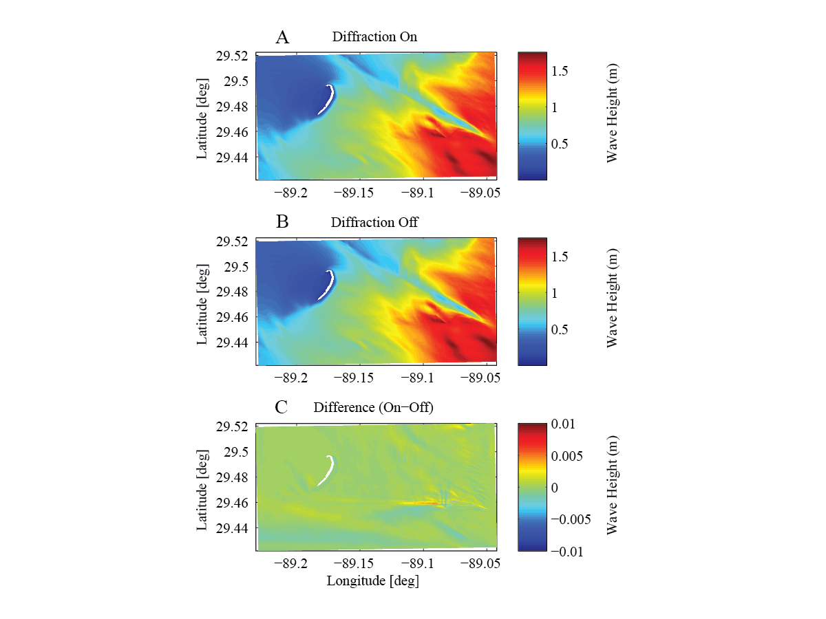 |
Figure 12. Model sensitivity to wave diffraction in grid G4 with pit 1 present for scenario H6_D7. (A) Significant wave height (in meters) results with diffraction on, (B) Significant wave height results with diffraction off, (On minus Off), difference in significant wave height from both results. [deg, degrees; m, meters] |
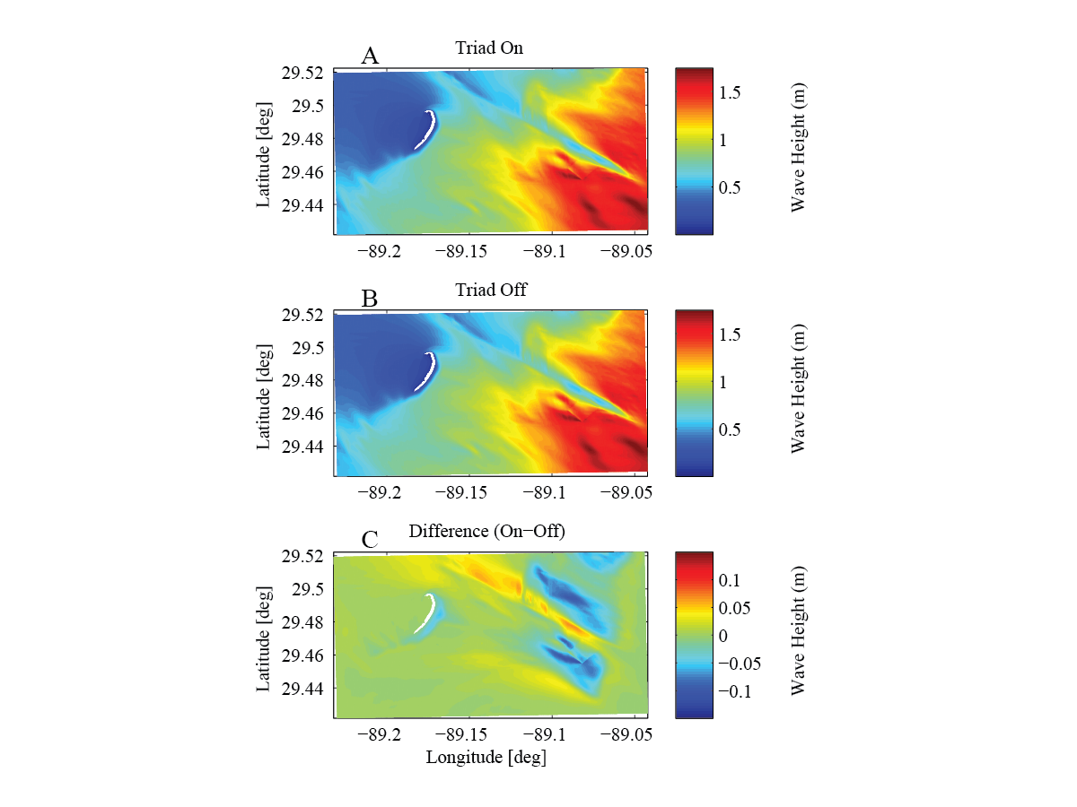 |
Figure 13. Model sensitivity to wave triads in grid G4 with pit 1 present for scenario H6_D7. Significant wave height (in meters) results with triads on (A), significant wave height results with triads off (B), difference in significant wave height from both results (On minus Off). [deg, degrees; m, meters] |
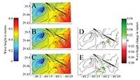 |
Figure 14. Weighted average significant wave height for the (A) baseline, no pit bathymetry, (B) bathymetry including borrow pit 1 (change from baseline shown in D), and (C) bathymetry including borrow pit 2 (change from baseline shown in E). Borrow pits are outlined in white. The average is created from the output of individual scenarios, weighted by their percentage occurrence over the time period December 1995 through December 2013 (fig. 2). The pits create a shadowing effect originating from the corners. |
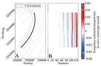 |
Figure 15. For 135 locations (A, black line) along Breton Island (0 m contour shown in green), longshore transport rate (B; eq. 1) for each of the 116 wave scenarios (fig. 2) for the no pit case. Red colors indicate northerly transport and blue colors indicate southerly transport. Moving from left to right in (B), the magnitude of transport increases for larger wave scenarios. Because the dominant wave direction for storms is from the south and southeast (fig. 2), there are few large wave scenarios with predominantly southerly directed transport. [m, meters] |
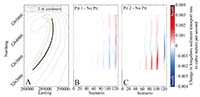 |
Figure 16. Change in the longshore transport rate (eq. 1) with the addition of pit 1 (B) and pit 2 (C) for each of the 116 wave scenarios (fig. 2) calculated at 135 locations (A, black line) along Breton Island (0 m contour shown in green). Red colors indicate a positive change in transport (more northerly or less southerly) and blue colors indicate negative change transport (more southerly or less northerly). |
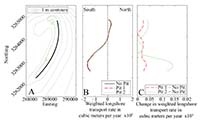 |
Figure 17. For 135 locations (A, black line) along Breton Island (0 m contour shown in green), average longshore transport rate (B, LSTR) calculated by weighting each of the 116 individual scenario results by its frequency of occurrence in the wave climatology (fig. 2). The change in magnitude of the weighted average longshore transport rate (C) with the addition of the pits is an order of magnitude less than the baseline values, and the overall pattern in transport is the same (B). |
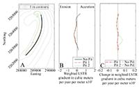 |
Figure 18. Gradient of average longshore transport rate (B, LSTR) constructed from the longshore transport calculated using wave conditions at 135 locations (A, black line) along Breton Island (0 m contour shown in green) for each of the 116 individual scenario results (e.g., fig. 15 for the no pit case) by weighting each scenario by its frequency of occurrence in the wave climatology (fig. 2). The change in magnitude of the gradient of the LSTR (C) with the addition of the pits is an order of magnitude less than the baseline values, and the overall pattern in transport is the same (B). Positive values in (C) indicate more accretion or less erosion, negative values indicate less accretion or more erosion. |
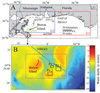 |
Figure A4-1. Maps showing (A) the location of Breton Island in the Gulf of Mexico, the G1, G2, and G3 numerical model domains, and the three National Data Buoy Center (NDBC) buoys (42040, 42012, and 42007) used in model scenario development and assessment, and (B) the elevations and spatial extent of the G3 model domain, showing the G4 domain as well as the extent of three proposed borrow pits considered in the wave modeling study. The channel running northeast of Breton Island is the Mississippi River Gulf Outlet (MRGO). |
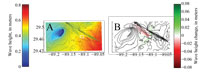 |
Figure A4-2. Weighted average significant wave height for (A) bathymetry including borrow pit 3 (outlined in white) and (B) change from the baseline case. The average is created from the output of individual scenarios, weighted by their percentage occurrence over the time period December 1995 through December 2013 (fig. 2). Borrow pit 3 creates a shadowing effect originating from the corners. |
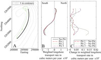 |
Figure A4-3. For 135 locations (A, black line) along Breton Island (0 m contour shown in green), average longshore transport rate (B, LSTR) calculated by weighting each of the 116 individual scenario results by its frequency of occurrence in the wave climatology (fig. 2). The change in magnitude of the weighted average longshore transport rate (C) with the addition of the pits is less than 30 percent of the baseline values, and the overall pattern in transport is the same (B). |
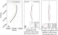 |
Figure A4-4. Gradient of average longshore transport rate (B, LSTR) constructed from the longshore transport calculated using wave conditions at 135 locations (A, black line) along Breton Island (0 m contour shown in green) for each of the 116 individual scenario results (e.g., fig. 15 for the no pit case) by weighting each scenario by its frequency of occurrence in the wave climatology (fig. 2). The change in magnitude of the gradient of the LSTR (C) with the addition of the pits is an order of magnitude less than the baseline values, and the overall pattern in transport is the same (B). Positive values in (C) indicate more accretion or less erosion, negative values indicate less accretion or more erosion. |
|

