Professional Paper 1386–A
Gallery contains 8 columns, so you may need to scroll to the right to see all images.
pp1386a2-fig01 |
pp1386a2-fig02a |
pp1386a2-fig02b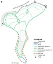 |
pp1386a2-fig03 |
pp1386a2-fig04ab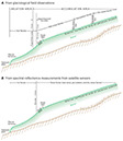 |
pp1386a2-fig04cd |
pp1386a2-fig05a |
pp1386a2-fig05bc |
pp1386a2-fig06a |
pp1386a2-fig06b |
pp1386a2-fig07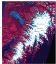 |
pp1386a2-fig08 |
pp1386a2-fig09 |
pp1386a2-fig10 |
pp1386a2-fig11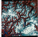 |
pp1386a2-fig12 |
pp1386a2-fig13 |
pp1386a2-fig14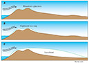 |
pp1386a2-fig15![Figure 15.—MODerate-resolution Imaging Spectroradiometer (MODIS) image of Île Kerguelen (Îles Kerguelen) on 4 March 2004. Cook Glacier (ice cap) and its outlet glaciers (12 named) are visible, as are glaciers (5 named) on three peninsulas: Presqu’ île de la Société de Géographie (north of Cook Glacier), Presqu’ île Rallier du Baty (southwest of Cook Glacier), and Presqu’ île Gallieni (southeast of Cook Glacier). NASA Aqua MODIS image. [http://visibleearth.nasa.gov; KerguelenIslands; File-Kerguelen. A2004064.0945.250m.jpg]](images/gallery-2/thumb/pp1386a2-fig15.jpg) |
pp1386a2-fig16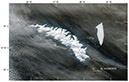 |
pp1386a2-fig17 |
pp1386a2-fig18 |
pp1386a2-fig19 |
pp1386a2-fig20 |
pp1386a2-fig21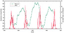 |
pp1386a2-fig22a |
pp1386a2-fig22b |
pp1386a2-fig23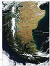 |
pp1386a2-fig24 |
pp1386a2-fig25a |
pp1386a2-fig25b |
pp1386a2-fig26 |
pp1386a2-fig27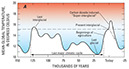 |
pp1386a2-fig27b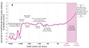 |
pp1386a2-fig28 |
pp1386a2-fig29![Figure 29.—Proxy temperatures [δ18O (‰)], climatic events, and tectonic events during the Cenozoic Era. A long-term trend of decreasing global temperatures
is apparent, along with a change from global “greenhouse” climate to global “icehouse” climate, resulting in increased glaciation, starting in the late Eocene. Modified from Zachos and others (2001, p. 688, fig. 2).](images/gallery-2/thumb/pp1386a2-fig29.jpg) |
pp1386a2-fig30 |
pp1386a2-fig31 |
pp1386a2-fig32 |
pp1386a2-fig33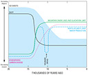 |
pp1386a2-fig34 |
pp1386a2-fig35 |
pp1386a2-fig36 |
pp1386a2-fig37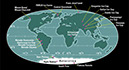 |
pp1386a2-fig38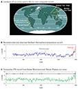 |
pp1386a2-fig39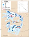 |
pp1386a2-fig40 |
pp1386a2-fig41 |
| Back to Top | |||||||
pp1386a2-fig42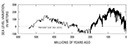 |
pp1386a2-fig43 |
pp1386a2-fig44 |
pp1386a2-fig45 |
pp1386a2-fig46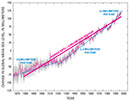 |
pp1386a2-fig47 |
pp1386a2-fig48 |
pp1386a2-fig49 |
pp1386a2-fig50 |
pp1386a2-fig51 |
pp1386a2-fig52 |
pp1386a2-fig53 |
pp1386a2-fig54 |
pp1386a2-fig55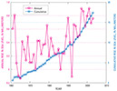 |
pp1386a2-fig56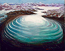 |
pp1386a2-fig57 |
pp1386a2-fig58 |
pp1386a2-fig59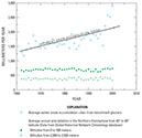 |
pp1386a2-fig60 |
pp1386a2-fig61 |
pp1386a2-fig62 |
pp1386a2-fig63 |
pp1386a2-fig64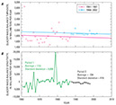 |
pp1386a2-fig65a |
pp1386a2-fig65b |
pp1386a2-fig66 |
pp1386a2-fig67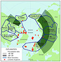 |
pp1386a2-fig68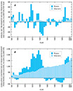 |
pp1386a2-fig69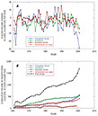 |
pp1386a2-fig70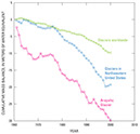 |
pp1386a2-fig71 |
pp1386a2-fig72 |
pp1386a2-fig73 |
pp1386a2-fig74 |
pp1386a2-fig75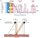 |
pp1386a2-fig76 |
pp1386a2-fig77 |
pp1386a2-fig78 |
pp1386a2-fig79 |
pp1386a2-fig80 |
pp1386a2-fig81 |
pp1386a2-fig82 |
pp1386a2-fig83 |
pp1386a2-fig84 |
pp1386a2-fig85 |
pp1386a2-fig86 |
pp1386a2-fig87 |
|

![]() U.S. Department of the Interior |
U.S. Geological Survey
U.S. Department of the Interior |
U.S. Geological Survey
URL: http://pubsdata.usgs.gov/pubs/pp/p1386a/gallery-2.html
Page Contact Information: GS Pubs Web Contact
Page Last Modified: Thursday, 01-Dec-2016 16:24:49 EST
